Let's talk about your nonprofit's website structure. Think of it as the foundation of your online home – when it's built right, everything works smoothly. But if the structure isn't quite right, you might accidentally turn away the very people you're trying to help.
61% of website visitors will abandon your website for another nonprofit in your niche if they don’t find what they’re looking for in just 5 seconds. This high percentage highlights the significant impact of your site architecture on bounce rates and user retention.
But don't worry – we've got you covered. In this guide, we'll walk you through exactly how to structure your website so it works better for everyone who visits. Whether you're planning to redesign your nonprofit website or seeking tips for improving your current site, you'll learn practical steps you can take right away.
Understanding Who Visits Your Website
First things first – think about the people coming to your website. Most nonprofits help three main groups of people:
- People who want to donate money to support your cause
- People who want to volunteer their time and skills
- People who need your help and services
Each of these groups comes to your website looking for different things. Donors want to know their money will make a real difference. People seeking services need clear information about how to get help. Volunteers want to learn about ways they can pitch in and make an impact.
Understanding who is visiting your nonprofit website will allow you to better understand and connect with your audience. You can start by using tools like Google Analytics to track where visitors come from, what pages they visit, and how long they stay. Analyze your existing data to see who your current donors, volunteers, and recipients are, including their donation patterns and demographics.
You can also create surveys or feedback forms to ask visitors directly about their interests, needs, and what brought them to your site. Finally, take a peek at your donation and newsletter sign-up data. By combining these insights, you can build a clear picture of your audience and tailor your content to inspire them.
For deeper insights into mapping your visitor paths:
Pages Every Nonprofit Website Needs
Think of your homepage as your nonprofit's front door. It needs to warmly welcome visitors while quickly showing them where to go next.
A good homepage should have:
- A clear message about what you do right at the top
- Easy paths for donors, volunteers, and people seeking help
- Real stories or numbers showing your impact
- Clear buttons for important actions like donating
- Updates about your current work
- Quick links to emergency help (if you offer it)
One nonprofit whose homepage features all of these key elements is Atlanta Habitat for Humanity. Since 1983, this organization has been on a mission to build strength, stability, and self-reliance by helping local Atlanta families purchase affordable homes.
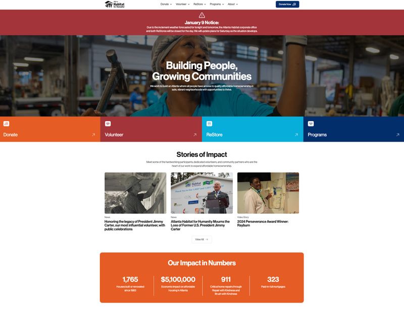
Here’s why this homepage works so well:
- Direct Messaging: The homepage prominently displays the mission statement, "Building People, Growing Communities," while a clarifying statement helps convey the organization's purpose to help people purchase affordable housing.
- Clear User Paths: Navigation is straightforward, with distinct sections for donating, volunteering, visiting the ReStore, and exploring programs. This enables users to easily find the information most relevant to their user journey.
- Powerful Storytelling: Featured stories about the foundation’s hardworking participants, volunteers, and community partners engage visitors and showcase the organization's positive influence.
- Authentic Imagery: The site uses genuine photos of volunteers and community members that foster a sense of connection and trust with their audience.
- Compelling Impact Statements: The homepage highlights key metrics, like "1,765 houses built or renovated since 1983" to demonstrate the tangible results of the organization's efforts.
- Prominent Calls to Action: Prominent buttons are strategically placed above the fold to encourage user engagement and support.
To explore the complete list of essential website elements:
- What Should a Nonprofit Website Include (20 Must-Have Features)
- 21 Nonprofit Website Best Practices [With Real-life Examples]
Optimizing Your About Section
Your About section helps people trust you. It's where you share your story and show that you're responsible with donor support.
Start with the basics, including your mission and vision. Make these crystal clear. Then introduce your team. Show the real people behind your work with friendly, authentic photos and short bios that highlight their dedication to your cause.
Tell your organization's story in a way that shows your growth and the good you've done. And be open about your finances – make it easy to find your annual reports and important documents.
For more strategies on building trust and sharing your story:
- How to Tell Your Nonprofit's Story Through Web Design
- Nonprofit Testimonials: The Complete Guide to Collecting and Displaying Impact Stories
Organizing Your Programs and Services
Let's talk about how to share information about your programs. The way you organize this information can make a big difference in how many people you help.
Start with a main page that gives people a quick look at all your programs – think of it as a menu of everything you offer. Then create separate pages for each program where you can share all the details. This helps people find exactly what they need without getting overwhelmed.
For each program page, include these important pieces:
- A simple explanation of who you help
- What kind of help you provide
- Who can qualify for help
- How to sign up or get started
- Stories about people you've helped
- Clear next steps and how to contact you
Making Donations Easy
Think about organizing your donation options like a store – you want your most popular items (in this case, ways to give) front and center, with specialty options nearby but not in the way.
Start with a main page that shows the most common ways people can help.
From there, create separate pages for other ways to give, like:
- Monthly giving clubs
- Planned giving and wills
- Business partnerships
- Giving items instead of money
- Matching gift programs
Here’s a tip: keep your main donation button clear and simple. You can offer other giving options without letting them distract from the basic "Donate Now" button that most people are looking for.
To optimize your donation experience even further:
- Donation Page Design: A Data-Driven Guide for Nonprofits
- Planned Giving Pages: Design and Content That Drives Legacy Gifts
Creating Clear Navigation
94% of website users believe simple navigation is the most important feature of a website. That’s because clear and simple navigation helps visitors find the information they’re seeking faster, which reduces frustration and increases the likelihood they'll stay on your site and take your desired action.
You can think of your website's navigation like street signs – it needs to help people find their way around quickly and easily. The average user spends only 6.44 seconds reviewing a site's main navigation menu, so make sure it’s accessible.
Main Menu Items
Keep your main menu simple and clear. Skip the fancy words and industry terms. Instead, use simple phrases that anyone can understand:
- Try "Get Help" instead of "Programs & Services"
- Use "Donate" instead of "Support Our Mission"
- Say "Join Us" instead of "Engagement Opportunities"
Feeding America, the largest charity working to end hunger in the United States, is one nonprofit that manages their main menu items well. Want to learn more about the mission and the people behind it? Click “Our Work.” Ready to volunteer? Click “Take Action.”
Perhaps most important, the “Find a Food Bank” link could not be more clear for individuals seeking food and resources. This simple yet intuitive menu structure allows users to quickly locate topics of interest.
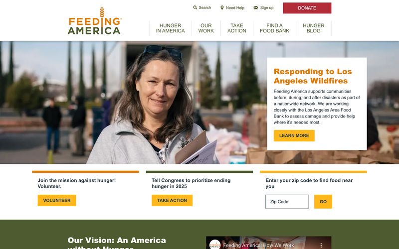
Other key navigation features we like include:
- Prominent Search Functionality: A search bar is readily accessible at the top of the page, enabling users to find specific content without hassle.
- Consistent Layout Across Pages: Uniform navigation elements across the site ensure a seamless user experience, as visitors can predictably find information in familiar locations.
- Responsive Design for Mobile Accessibility: The website's navigation adapts smoothly to various devices, maintaining usability on smartphones and tablets.
- Strategic Placement of Call-to-Action Buttons: The “Donate” button that visitors tend to look for is prominently displayed at the top, while additional buttons in other places guide users toward meaningful engagement with the organization's mission.
These thoughtful design choices contribute to a user-friendly experience and effectively connect visitors to both resources and opportunities to get involved.
Other Important Links
Put your less-used (but still important) pages in your website's footer or a secondary menu. This includes things like:
- How to contact you
- Financial reports
- Privacy information
- Press materials
- Email signup
To ensure your navigation works for everyone:
Organizing Your Content
Think of your content like building blocks – each piece should fit nicely with the others. Your goal is to help people quickly find what they need while encouraging them to take action.
Put your most important information at the top of each page. Most people scan websites quickly, so make your key points easy to spot. Break up long sections with clear headings and bullet points to make reading easier.
Remember – lots of people will look at your website on their phones. Your content needs to work well on both big and small screens. This means thinking carefully about what information to show first when space is limited.
Special Elements Nonprofits Should Consider
Creating an effective nonprofit website means incorporating additional thoughtful elements that inspire trust, drive engagement, and showcase your mission’s impact, such as:
Emergency Help Access
If your organization helps people in crisis, they need to find help fast. Consider adding a bright "Get Help Now" button that stays visible as people scroll down your page. You might also want to keep emergency contact information at the top or bottom of every page.
Create a special section just for crisis resources. Make sure it loads quickly and works perfectly on phones – someone in an emergency might only have their mobile device available.
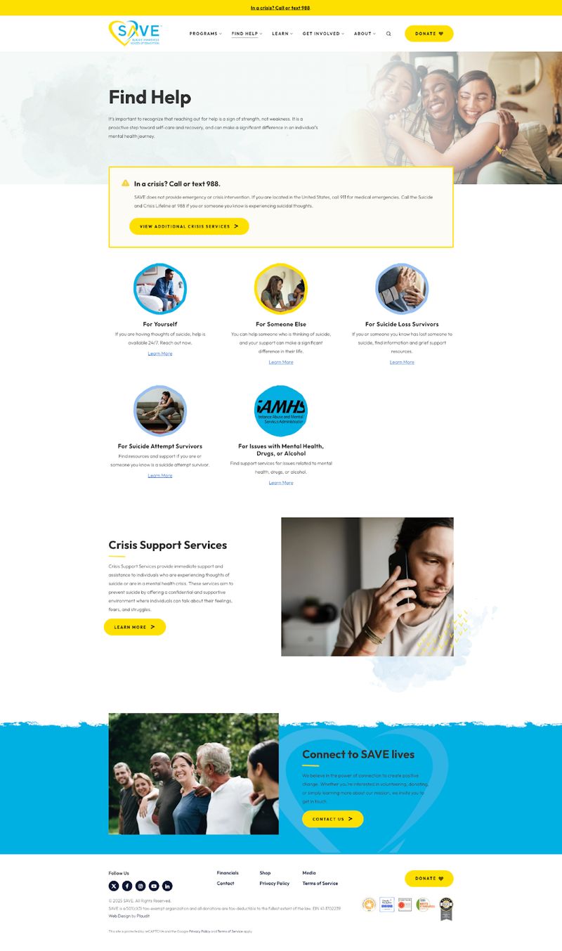
Take SAVE, for example. This national nonprofit is dedicated to ending suicide through a combination of education, training, and advocacy. All visitors to the website get an immediate popup encouraging them to call 911 if they have a medical emergency, or call or text the Suicide and Crisis Lifeline if they are experiencing suicidal thoughts.
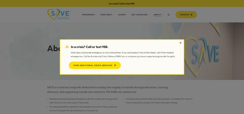
Help remains readily accessible even after visitors have clicked out of the popup – the bright yellow bar with the hotline’s phone number is featured at the top of every website page. We love that the “Find Help” link in the navigation menu ensures that emergency resources are so easy for those in crisis to find, and that the page offers personalized support according to the organization’s key demographics.
Simple Donation Processes
Donating should feel as easy as buying something from your favorite online store – and yet nonprofit donation pages have an average abandonment rate of 50-70%. You can decrease this rate with a simple, streamlined donation process that minimizes friction and makes it easy for donors to contribute.
Here's what helps:
- Put your donation button where it's easy to spot
- Keep your forms short and simple
- Limit form fields to information you truly need
- Offer recommended donation amounts, the ability to customize the contribution, and recurring donation options
- Offer several ways to pay
- Incorporate elements like progress bars and processing fee coverage
- Include trust signals like security badges
- Remove anything that might distract someone from completing their donation
Success Stories and Impactful Statistics
People want to see how they're helping when they support you. Don't hide your success stories in long reports – spread them throughout your website!
Mix different ways of sharing your impact:
- Big numbers on your homepage
- Details about program results
- Stories about real people you've helped
- Updates about ongoing projects
For example, Rotary International effectively showcases its impact across various locations and in several different ways across their website. The charity highlights several key numbers that reveal their impact right from their homepage, like:
- Their global network has over 1.2 million members
- Volunteers contribute over 47 million work hours each year
- The organization has contributed $291 million to global service initiatives in the last year
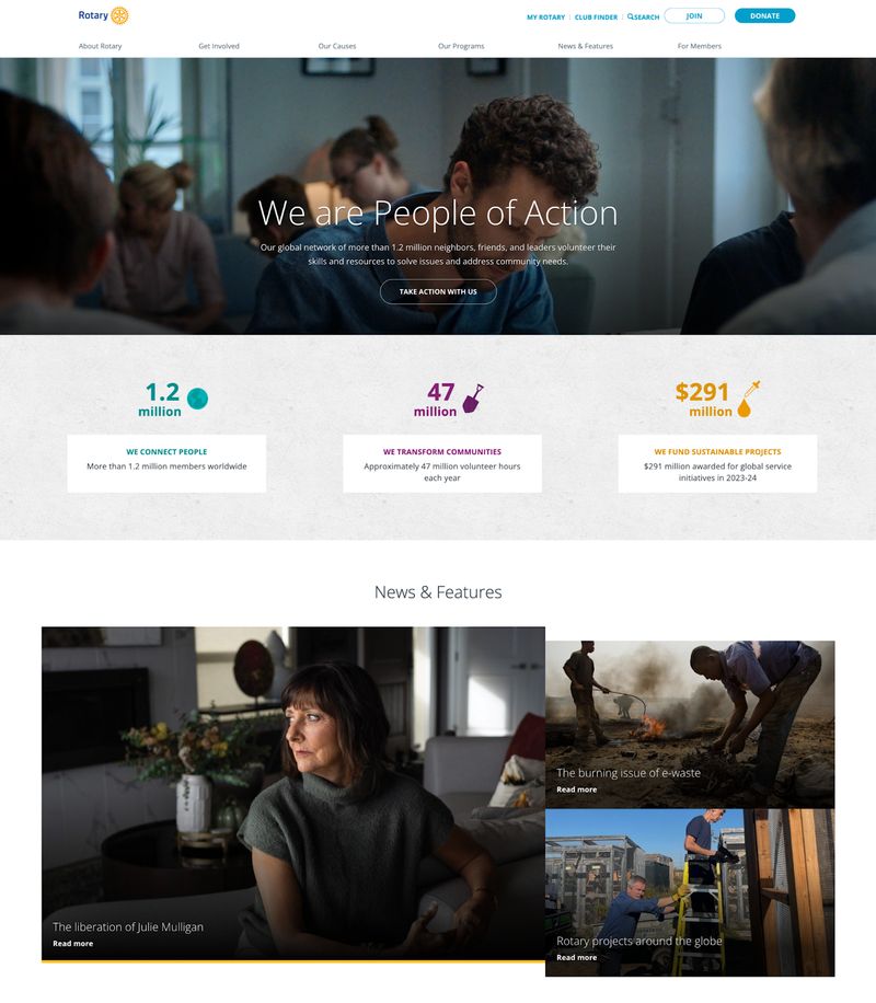
Website visitors who want to learn more about a specific program can choose a cause, like “Ending Polio” or “Promoting Peace,” to learn how the charity tackles the issue, see updates on ongoing projects, and discover the incredible results that reveal the huge impact the organization is making.
Finally, the “News & Features” section showcases real stories about the people who have been helped and the foundation’s impact across the globe, while a good mix of stories, statistics, video, and images ensure all types of visitor preferences are considered.
For additional critical website components:
- Do Nonprofit Websites Need a Privacy Policy? A Complete Guide
- The Complete Guide to Nonprofit Website Security
Technical Tips That Make a Difference
Good technical choices make your website easier to manage and help more people find you online. Here are some key things to think about.
Following URL Best Practices
Crafting clear, user-friendly URLs is an essential part of a successful nonprofit website. A great URL isn’t just good for SEO – it also helps people figure out what’s on each page.
Here are some URL best practices to keep in mind:
- Keep URLs Short But Descriptive: Concise yet descriptive URLs are easier to read, remember, type, and share. For example, instead of yournonprofit.org/page-id?=12345, aim for something like yournonprofit.org/about.
- Use Keywords That Reflect Your Mission: Incorporate relevant keywords that align with your nonprofit’s focus. This helps search engines understand your content and boosts your visibility. For instance, a nonprofit focused on education could use a URL like yournonprofit.org/after-school-programs.
- Avoid Special Characters and Excessive Numbers: Stick to letters, numbers, and hyphens to keep your URLs clean and professional. Special characters (&, %, @, etc.) can confuse users and may cause technical issues.
- Be Consistent with Naming Conventions: Create a standardized structure for your URLs to keep them organized, like using lowercase letters and separating words with hyphens instead of underscores. Instead of yournonprofit.org/Our_Impact, try yournonprofit.org/our-impact.
Optimizing Your Website for Mobile Devices
These days, lots of people will visit your website using their phones. In 2023, over half (52%) of all users visited nonprofit websites on a mobile device. That’s why your site needs to work just as well on a small screen as it does on a computer.
Think about how your menu works on a phone. Drop-down menus that work fine on a computer might be tricky to use on a small touchscreen. Your mobile menu should be easy to use with just your thumb while still letting people get to all the important parts of your site.
And don’t overlook the importance of optimizing your donation forms for mobile devices. You can increase donor conversion rates by 15% by taking a few simple mobile optimization steps, like keeping your form short and simple, using large, easy-to-tap buttons, and ensuring it loads quickly on all devices.
To improve your website's technical performance:
- Nonprofit Website Speed Optimization: Why It Matters and How to Improve It
- Nonprofit Website SEO: A Complete Guide
Common Mistakes to Watch Out For
After years of helping nonprofits with their websites, we've seen some common problems that can make websites less effective. Here's what to avoid:
Hiding Important Information
Don't bury important details deep in your website. If someone has to click through four different pages to find your contact information or donation page, they’re likely to abandon your site. Make important information easy to find.
Confusing Navigation
Your menu should work the same way on every page. Once visitors learn how to get around your site, that knowledge should help them everywhere on your website.
Avoid common navigation mistakes like:
- Too many menu options
- Inconsistent labeling across pages
- Listing the same page in multiple menu sections
- Using technical terms or industry jargon in navigation labels
- Failing to maintain a consistent structure across different device types
These types of issues can confuse visitors and negatively impact the user experience, causing them to become frustrated and leave your website altogether.
Dead Ends
Always give people somewhere to go next. Whether it's making a donation, signing up to volunteer, or learning more about your programs, visitors should never feel stuck without a clear next step.
Checking How Well Your Structure Works
The best nonprofit websites enhance their site structure over time based on how people actually interact with the site.
Performance Tracking Tools
Set up tracking tools to watch things like:
- How people move through your site
- Which pages they visit most
- Where they tend to leave
- How they find important information
Google Analytics is an ideal tool for nonprofits looking to gain valuable insights about website traffic, audience behavior, and marketing campaigns without a large budget. Heat mapping tools like Hotjar can help you visualize how users interact with your website and what elements they click the most. Make sure any tool you choose can help you analyze the performance of important forms, like your contact form and donation form.
Metrics You Should Track
Tracking the right metrics is essential for ensuring your nonprofit website is as impactful as possible. Keep an eye on the following metrics so you can understand what’s working, what’s not, and how to better engage your audience:
- Website Traffic: Track the number of visitors and where they’re coming from—social media, search engines, or email campaigns.
- Bounce Rate: Monitor how many visitors leave after viewing just one page to spot areas for improvement.
- Conversion Rates: Measure how many visitors take meaningful actions, like donating, signing up for your newsletter, or volunteering.
- Time on Page: See how long people spend on important pages to gauge their engagement.
- Mobile Performance: Check how well your site performs on mobile devices, including load times and navigation.
- Donor Retention Rate: Explore donor loyalty by tracking how many donors continue to contribute to your cause on a yearly basis.
- Donor Acquisition Cost: Measure the cost associated with acquiring a new donor.
- Average Gift Size: Understand the average donation amount for a given donor group, campaign, or time period.
- Fundraising ROI: Track your return on investment, or the cost of your fundraising efforts compared to revenue.
By tracking these metrics, you’ll have the data you need to create a website that truly resonates with your audience and drives meaningful action.
For comprehensive evaluation and tracking strategies:
- Nonprofit Website Metrics That Matter: KPIs to Track for Mission Success
- Nonprofit Website Audits: A Comprehensive Guide for Evaluation
Ready to Improve Your Site?
Here’s how to start:
Look at What You Have Now
Start by making a list of all your pages and how they connect. Look for:
- Pages that people have trouble finding
- Information that shows up in multiple places
- Areas where visitors often get confused
- Important details buried too deep in your site
Plan Your New Structure
Once you know what's working and what isn't, you can plan improvements. Start with a simple map of your main sections and how they'll connect. Share this plan with your team and get their feedback before making changes.
Remember that updating your website's structure is a chance to make your online presence work better for your mission. Take time to get it right – good structure will help every visitor have a better experience with your organization.
Taking the Next Step
A well-organized website makes it easier for you to help more people. It helps visitors find your services, encourages donations, and builds trust with your community.
But you don’t have to complete an entire nonprofit website design to see drastic improvements. Start by improving one section at a time following nonprofit website best practices.
Focus first on the parts that matter most to your key audiences. Watch how people use these improvements and keep making your structure better based on what you learn.
Remember – your website's structure should make it easy for people to support your cause and get the help they need. Every improvement you make to your structure helps you make a bigger difference in your community.
Ready to implement these changes? Here are your next resources: