Throughout our years of building websites for nonprofits, we’ve seen many organizations work tirelessly for their cause. Sadly, many don't see the results they were hoping for.
In most cases, the lack of results isn't due to the lack of effort. Almost all of the people we've met genuinely pour their heart and soul into their work. If you’re currently going through this, just know that it’s not your fault.
The problem often comes down to a few missing pieces on their website. That’s why we put together this nonprofit best practices guide. Chances are, you’ll see a noticeable difference if you implement the tips we outline in this article. We’ll also include plenty of real-world examples to show how other nonprofits have successfully implemented them.
I. User experience (UX)
User experience influences everything on your website, from conversions to search engine optimization (SEO). Visitors love sites that are easy to navigate and provide quick access to the information they need. The positive experience encourages them to return and increases their likelihood of supporting your cause.
Website navigation and information architecture
Feeling lost or encountering a broken link can be pretty frustrating when navigating a website. It might your brand memorable but not in a good way. Most visitors will just leave and never return. On the other hand, if they can easily find what they're searching for, they're more likely to stick around, engage, and take action. Here are some tips for better website navigation.
Content architecture: A well-defined information architecture is the foundation of a user-friendly website, so it’s important to organize your website's information logically. Think about how your target audience looks for information, and organize your content to meet their needs. Mapping out a customer journey is a very helpful exercise. It's also important to use clear headings, subheadings, and menus to guide visitors through your site.
Intuitive menu structure: Use a clear and concise menu structure that is easy to understand and navigate. Avoid using jargon or overly technical terms that your audience may not be familiar with. A well-organized menu should allow visitors to quickly find the necessary information without clicking through multiple pages.
Descriptive page titles and URLs: Use descriptive and keyword-rich page titles and URLs that accurately reflect the content of each page. It improves user experience and helps with search engine optimization (SEO). For example, instead of using a generic URL like "yourwebsite.org/page1," use a descriptive URL like "yourwebsite.org/donation-opportunities."
Internal linking: Use internal links to connect related pages within your website. Proper interlinking makes it easier for users to navigate your site and find relevant content. It also helps search engines understand the structure and hierarchy of your website. For instance, if you have a blog post about a specific program, provide a link to the program's main page within the blog post.
Breadcrumbs: Implement breadcrumbs to show users where they are within the website's hierarchy. Breadcrumbs provide a visual trail, allowing users to easily navigate to previous sections. They improve the overall user experience on the site and help with SEO.
Responsive design
A well-optimized responsive design improves user satisfaction, which ultimately leads to higher conversion rates. Here are a few best practices to keep in mind when building a responsive website.
- Responsive design: Ensure your website adapts seamlessly to different screen sizes, providing an optimal viewing experience across desktops, laptops, tablets, and smartphones.
- Touch-friendly elements: Design buttons and links that are large enough to tap comfortably on a touchscreen device.
- Fast loading times: Optimize your website's performance to ensure quick loading times, as mobile users are often impatient.
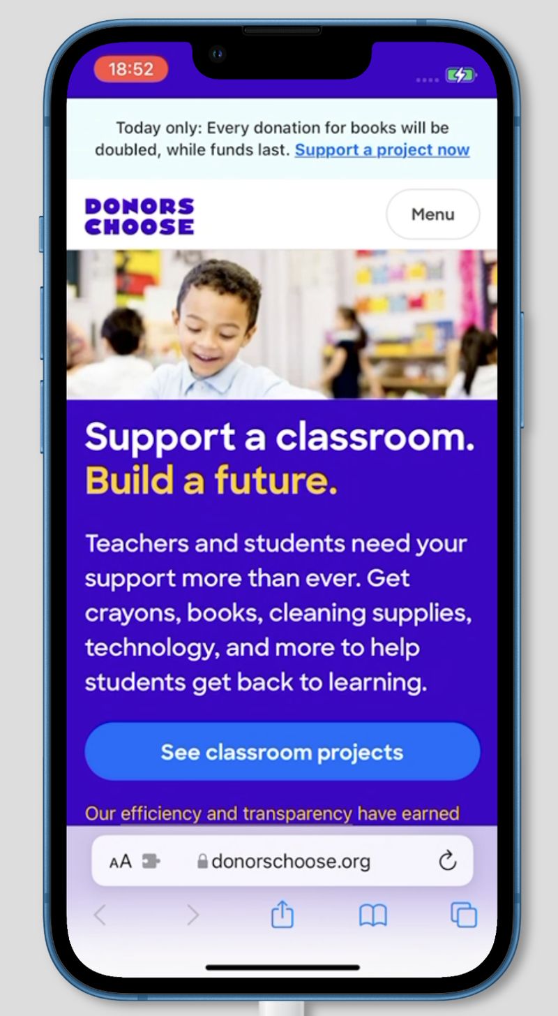
Example: DonorsChoose, a nonprofit that supports public school classrooms, offers a great example of a mobile-friendly site. It’s easy to navigate, loads quickly, and the donation process is streamlined for mobile users.
Accessibility
Every user deserves equal access to your website’s content and functionality, regardless of their abilities. Here are a few ways to make your site more accessible.
- Alt text for images: Provide alternative text descriptions for all images so that users with visual impairments can understand their content using screen readers.
- Keyboard navigation: Users who cannot use a mouse should be able to navigate your website using only a keyboard.
- Color contrast for readability: Use a color contrast checker to ensure sufficient contrast between text and background colors, making it easier for low-vision users to read your content.
- Best practices: Follow accessibility recommendations outlined in Web Content Accessibility Guidelines (WCAG) for font size, color contrast, media, and alternative text for images.
- Multiple languages: Offering your website in multiple languages broadens your reach and inclusivity. Multi-lingual websites are especially useful for nonprofit organizations operating in multilingual regions or serving diverse communities. Clearly label different language versions and provide easy navigation between them. Screen readers may not automatically switch languages, so proper labeling is crucial for a seamless multilingual experience.
Example: MSF offers content in English and Arabic. Visitors can easily switch languages with just one click.

For comprehensive guidance on making your nonprofit website accessible to all visitors:
Search functionality
A well-implemented search function can be a lifesaver for users who know what they're looking for but prefer not to browse your entire site. To enhance usability, place your search bar prominently and make sure your search function delivers accurate and relevant results.
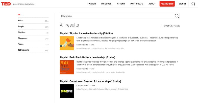
Example: TED, the nonprofit dedicated to spreading ideas, does an excellent job with its search functionality. It allows users to filter results by format (talks, blogs, podcasts) and provides relevant suggestions as you type.
If you found this article helpful, you might also like our post on foundational features every nonprofit website needs.
II. Compelling content and storytelling
Your website is more than just a collection of information; it's a platform to tell your story and connect with your audience emotionally. Compelling content and effective storytelling can engage visitors and inspire them to donate.
Define your mission and impact
Visitors should immediately understand what your organization does and the impact you make. Clearly articulate your mission, vision, and values using concise and impactful language. Avoid jargon and focus on communicating the positive change you create.
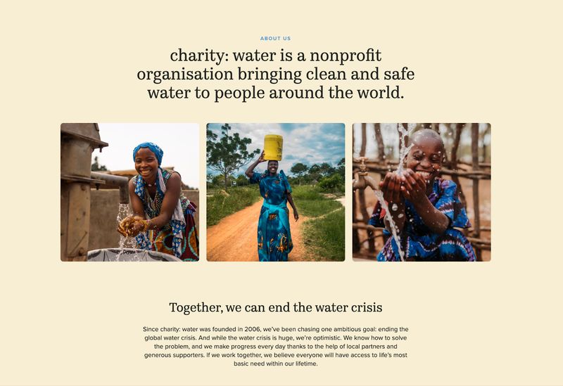
Example: charity: water clearly states their mission is to end the global water crisis. They also use striking images and statistics that clearly demonstrate the problem they're addressing and the tangible results of their work. They do a great job of demonstrating important values like integrity, accountability, and transparency.
To learn more about crafting compelling nonprofit content and storytelling:
- How to Write Effective Nonprofit Website Content: A Strategic Guide
- How to Tell Your Nonprofit's Story Through Web Design
Engaging storytelling
The magic of stories lies in their ability to connect people on a deeper level than mere facts and figures. They humanize your cause and inspire action. Here are some effective storytelling approaches for your nonprofit website:
- Beneficiary stories: Share the personal stories of individuals whose lives have been positively impacted by your organization's work. These stories put a human face on your mission and demonstrate the tangible difference you make.
- Impact stories: Showcase the overall impact of your programs and initiatives. Quantify your successes and demonstrate how donations are used to achieve meaningful results. Use data and metrics to illustrate the effectiveness of your work and the positive change you create.
- Data storytelling and visualizations: Transform raw data into compelling narratives through charts, graphs, and other visual representations. Data visualizations make complex information more accessible and engaging, allowing visitors to easily grasp the impact of your efforts.
- Behind-the-scenes content: Offer a glimpse into the inner workings of your organization. Share stories about your staff, volunteers, and the day-to-day activities that drive your mission. Peeling back the curtains fosters transparency and builds trust with your audience.
- Mission-driven narratives: Tell stories related to your organization's mission and values. These narratives should reinforce your core purpose and inspire visitors to support your cause.
- Community partnership stories: Highlight successful collaborations with other organizations or community groups. These stories demonstrate your commitment to partnership and showcase the collective impact you achieve together.
- Founding story: Share the story of how your organization came to be. Highlight the challenges that inspired its creation and the vision of the founders. This narrative should capture the passion and determination behind the inception of your nonprofit. Illustrate the pivotal moments that shaped your mission and the values that guide your work today. A compelling founding story not only connects visitors to the heart of your organization but also serves as a powerful reminder of why your cause matters.
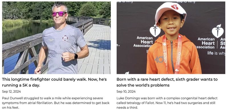
Example: The American Heart Association tells compelling stories of heart disease and stroke survivors, highlighting the impact of research and support programs. These personal narratives resonate with readers and inspire donations to the nonprofit.
Visual storytelling
Use high-quality images and videos to tell your story visually and enhance your narrative.
- On-brand imagery: Use consistent visuals that align with your brand identity and resonate with your target audience.
- Informative infographics: Present data and complex information in a visually appealing and easily digestible format.
- Emotionally appealing photos and videos: Use powerful images and videos that evoke emotion and connect with viewers on a personal level. Show the human aspect of your work and the real people you impact.
- Use professional-quality photos and videos: Invest in visuals that support your mission. While it’s not always about the production quality, avoid using blurry or amateurish photos and videos, as this can detract from your message. Use visual storytelling to appeal to the visitor’s emotions.
For guidance on ethical and impactful visual content:
III. Digital marketing
SEO basics for nonprofits
Search engine optimization (SEO) simply means positioning your website to rank higher in search engine results pages (SERPs). When people search for keywords related to your cause, you want your website to appear at the top.
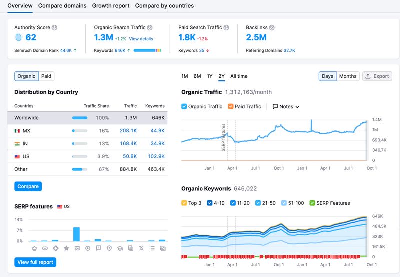
- Keyword research: Identify relevant keywords that potential donors and volunteers might use when searching for organizations like yours. Use these keywords strategically in your website's page titles, headings, and body text.
- On-page optimization: Optimize your website's structure and content to make it easy for search engines to understand and index your pages. Using keywords, descriptive page titles, meta descriptions, and header tags are all part of on-page optimization.
- Off-page optimization: Backlinks are like votes of confidence from other sites, signaling to search engines that your website is a trustworthy and authoritative source of information. Gaining high-quality backlinks from reputable websites can improve your SEO.
For a deep dive into nonprofit SEO strategies:
Content marketing
Creating valuable and engaging content is key to attracting and keeping your target audience. Content marketing goes beyond merely promoting your organization; it’s about offering information and resources that truly resonate with what your audience cares about. For instance, sharing blog posts filled with insightful articles, practical tips, and expert advice can help position your organization as a leader in your field.
Another effective approach is using infographics, which can turn complex data into visually appealing and easily digestible formats. These shareable graphics can help spread your message further, reaching a wider audience. Video is another powerful tool for telling compelling stories and showing the impact of your work.
Podcasts are also growing in popularity. This audio format allows you to engage listeners with insightful discussions, expert interviews, and personal stories related to your cause. By offering valuable content in various formats, you create opportunities for your audience to learn and connect with your mission, making it easier for them to engage with your organization in meaningful ways.
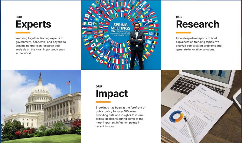
Example: Brookings, a nonprofit organization that conducts in-depth research on a variety of public policy issues, is an example of a nonprofit doing content marketing. Their content marketing strategy includes publishing detailed reports, engaging blog posts, and sharing expert insights to foster discussion about pressing policy issues. This approach helps them establish credibility and connect with a diverse audience that wants to make informed policy decisions.
Social media integration
You can connect with your audience, build a community, and promote your cause by thoughtfully integrating social media into your nonprofit website.
Start by adding social media buttons to your site so visitors can connect with you on platforms like Facebook, Twitter, and Instagram. Consider embedding social media feeds directly onto your site to display real-time updates and activity. It keeps your website content fresh and encourages visitors to engage with your social media profiles.
You can also feature shareable content, such as blog posts or impact stories, with clear sharing buttons that allow readers to spread your message across their networks. Encourage visitors to share their views by leaving comments. Finally, consider running campaigns or challenges to generate user-generated content and spread your message.
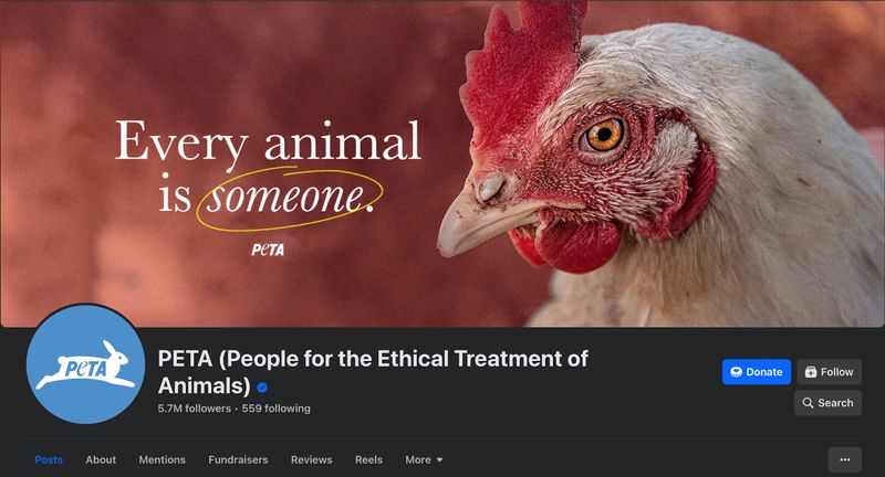
Example: PETA, the largest animal advocacy organization in the world, effectively uses social media to engage with supporters, share updates, and drive traffic to their website.
Email marketing
Email marketing is not just about sending newsletters; it's about building relationships. It’s a powerful channel for nonprofits to connect with their supporters and drive engagement. It allows you to share your mission, updates, and success stories directly to the inboxes of those who care about your cause. You can turn casual supporters into dedicated advocates and donors with the right approach.
Personalized copy, segmented lists, and timing are the core pillars of an effective email marketing strategy. Sending emails during key moments, such as holidays or special events related to your mission, can increase engagement and donations. Similarly, segmenting your email list allows you to tailor your communications to the interests and behavior of your supporters, making them more effective. Make sure to track key metrics like open rates and click-through rates to understand what resonates with your audience.
Paid ads
While organic reach is important, paid advertising can help you reach a wider audience and achieve specific marketing goals. A well-optimized website plays a crucial role in the effectiveness of these paid ads. Nonprofit websites can reconnect with visitors who have previously engaged with their website by using retargeting ads. So, make sure you have the right tracking and retargeting scripts on your website. A good advertising strategy keeps your cause top-of-mind and encourages potential donors or volunteers to return and take action.
Nonprofits are eligible for Google Ad Grants, which provide free advertising credits to promote their cause through search engine advertising. Also, look into other media buying platforms like Facebook, Instagram, LinkedIn, and TikTok. Most of these platforms offer targeted advertising options to reach specific demographics and interests.
Example: Check out these Facebook ads run by American Red Cross Blood Donors.

Analytics and tracking
Data-driven decision-making is essential for optimizing your website and digital marketing efforts, so it's important to use analytics tools to track performance, understand user behavior, and identify areas for improvement. Use Google Analytics and Search Console to get valuable insights into website traffic, user engagement, and search engine rankings. Monitor key performance indicators (KPIs) such as website traffic, bounce rate, conversion rate, and time on site to better understand how users interact with your website. This data can inform your content strategy, website design, and overall marketing efforts.
To track the metrics that matter most for your mission:
IV. Conversion rate optimization
Driving traffic to your website is only half the battle. Once visitors arrive, you must convert them into donors, volunteers, or advocates for your cause. Conversion rate optimization (CRO) aims to maximize the percentage of visitors who take a desired action on a website.
Donation page
Your donation page is one of the most important pages on your website. It's where visitors turn into donors, so it needs to be user-friendly, secure, and optimized for conversions.
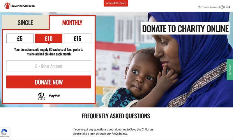
Start by making it easy for people to find the donation option on your website. If the page feels cluttered or confusing, you risk losing potential contributions. Offer different donation methods, like one-time and recurring contributions, to give donors more choice. Recurring payments allow you to accommodate their preferences while ensuring a steady flow of funding for your organization. Use a secure and reliable payment processor to build trust and reassure potential contributors that their data is safe.
Example: The Save the Children nonprofit has a great donation page. The page effectively communicates the impact of contributions by clearly outlining how each donation amount can help specific causes, such as providing food vouchers or hygiene kits. The use of testimonials and success stories personalizes the experience and connects potential donors to the real-world effects of their generosity. The FAQ section addresses common concerns and questions about the donation process, which increases transparency and builds trust with potential donors.
To optimize your donation pages for maximum conversions:
- Donation Page Design: A Data-Driven Guide for Nonprofits
- 18 Proven Strategies to Increase Your Nonprofit Donations This Year
Donation forms
You can also use simple forms as an alternative to standalone donation pages. Keep your forms short and simple to avoid overwhelming donors. The easier it is to donate, the more likely people are to complete the process.
Add step-by-step forms instead of one big giant form to reduce drop-off. It breaks down the donation process into smaller steps, which can increase completion rates. Avoid unnecessary fields that could deter donors. When adding a field, ask yourself: does this field really need to be there? Another good practice is to pre-fill fields whenever possible. A pre-populated donation amount or donor information for returning donors are some examples of pre-filled fields.
Security and trust indicators
Security and trust indicators are crucial for building credibility on your nonprofit website. Your website should use HTTPS, which protects donor information through encryption. Clearly display your privacy policy to reassure supporters that their data will be handled responsibly.
Donors are more likely to contribute when they see real people behind the mission. So, highlight your leadership team to build trust. Choose secure and reputable payment processors to handle transactions. Finally, comply with regulations like GDPR to demonstrate your commitment to data protection.
Individually, these elements might seem trivial. However, when these elements come together, they encourage donations and strengthen donor relationships.
For comprehensive security and privacy guidance:
- The Complete Guide to Nonprofit Website Security
- Do Nonprofit Websites Need a Privacy Policy? A Complete Guide
Contact information
Contact form is probably the most underrated and overlooked element on nonprofit websites. The contact information offers an easy way for visitors to reach out with questions, feedback, or interest in your mission. A user-friendly contact form invites engagement and shows that you genuinely care about what your audience has to say. Plus, collecting information through the form can help you build a list of individuals eager to learn more or get involved.
Remember to respond promptly to any messages you receive. Quick replies strengthen relationships and demonstrate that you’re attentive to your supporters' needs. This simple feature can really enhance how people connect with your organization.
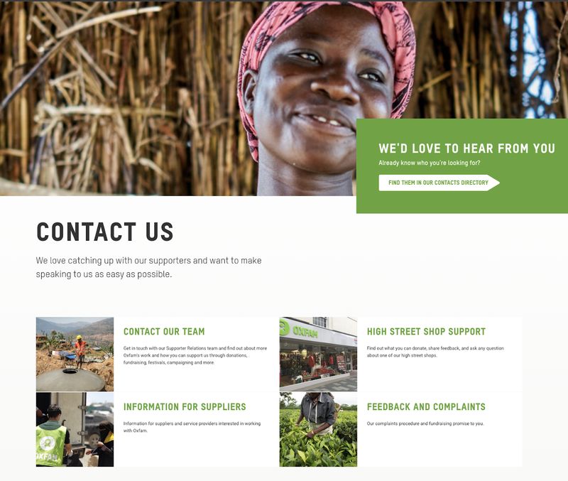
Example: Oxfam provides a comprehensive contact page with multiple contact methods and clear instructions for different inquiries.
Transparency and accountability
Transparency and accountability are vital for building trust with your supporters. Sharing financial reports and annual reviews shows donors that your organization is transparent and accountable with their contributions. This openness demonstrates responsible stewardship of funds and reassures supporters that their money is making a difference.
Highlighting impact metrics is another way to showcase the tangible results of your work. It helps people see the real-world effects of their donations. Don’t forget to share impact stories that illustrate the lives changed by your organization; these narratives resonate deeply and inspire confidence in your mission. Being open about your operations and outcomes creates a stronger connection with your audience and encourages ongoing support.
To effectively showcase your impact through testimonials:
Clear call-to-action (CTA) buttons
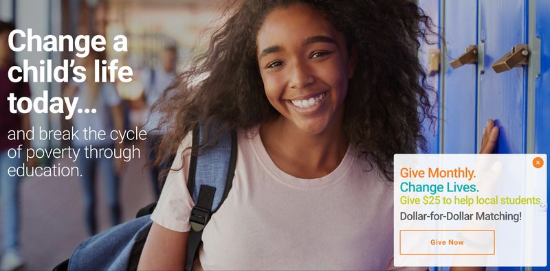
Clear and compelling call-to-action (CTA) buttons direct visitors toward desired actions on your website. There are a few best practices your CTA buttons should follow. One is to clearly communicate what you want the website visitor to do. It's also important to strategically incorporate CTAs into your header, footer, and key pages. If you want to motivate people to click, use contrasting colors and action-oriented language, such as "Donate Now" or "Volunteer Now," instead of vague phrases like "Learn More."
Example: Take Stock in Children Inc.’s website is a good example. Their CTA button has orange borders and action-oriented copy that says "Give Now." It stands out against the background and catches the visitor’s attention.
V. Engage your audience
The long-term success of your nonprofit hinges on the people behind it. You need to cultivate a sense of shared purpose and belonging to attract loyal fans. Here are a few ways to encourage participation effectively engage your audience.
Newsletters
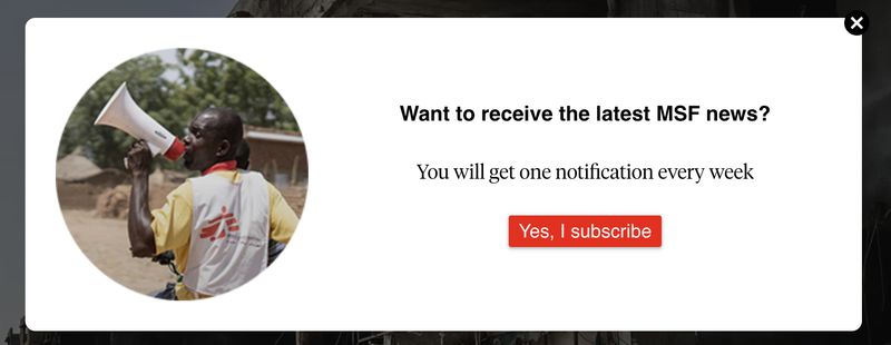
Newsletters help nonprofits nurture relationships with supporters, share important updates, and encourage donations. Start by collecting email addresses through incentives such as informative newsletters or exclusive content. Segment your subscribers based on their interests and past engagement to send them tailored emails. Don't forget to share stories of impact, upcoming events, and volunteer opportunities to foster a sense of community and inspire action from your readers. Consistent, targeted newsletters keep your supporters informed and more committed to your cause.
Example: Here’s an example of MSF collecting email addresses to send newsletters. Subscribers get exclusive content, latest updates, and opportunities to support their mission.
Volunteer opportunities
If you want to attract and recruit volunteers effectively, provide clear information about available opportunities. A simple online form can go a long way—let interested individuals express their interest and submit their info in just a few clicks.
Make it easy for potential volunteers to find out how they can get involved by detailing the different roles you offer. Specify the time commitment and skills needed for each position to make sure you’re attracting the right people. Including testimonials from current and past volunteers is a good way to demonstrate the impact of their work and encourage new volunteers to join.
Blog or news section
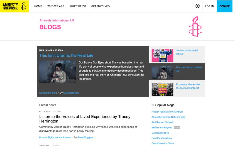
Maintain your website's blog or news section to share updates about your programs, projects, and new opportunities. It keeps your audience in the loop and can also give your search engine rankings a nice boost. Share insights and thought leadership content to establish your organization as a go-to source of information in your field. You also engage your audience more deeply by providing valuable and relatable content.
Example: Amnesty International maintains a blog section to talk about its work, campaigns, and human rights issues.
For content ideas to keep your blog fresh and engaging:
VI. Choosing the right tools
The right tools can streamline your website management and digital marketing efforts. Here are some key tools to consider:
Content Management Systems (CMS)
A content management system (CMS) is a software application that allows you to create, manage, and publish website content. Different systems have different strengths and weaknesses. Select a CMS that meets your organization’s needs and technical expertise. Popular options include WordPress, Webflow, Framer, and Squarespace.
Website builders:
Website builders offer user-friendly drag-and-drop interfaces for creating websites without coding. They're a good option for nonprofits with limited technical resources. Consider ease of use, customization options, and scalability when selecting a builder.
Consider user-friendly website builders like Wix or Squarespace if you’re doing it yourself and have very limited technical expertise. Most people go with Webflow or Elementor when they want a WordPress site. Here’s a comparison between Webflow and Elementor, if you’re trying to decide between these two platforms.
To understand the costs and platform options for your nonprofit website:
- Nonprofit Website Costs: A Complete Pricing Guide for 2025
- Webflow for Nonprofit Websites: A Complete Guide
- Small Nonprofit Website Guide: Big Impact on a Small Budget
Email marketing platforms
Email marketing platforms help you manage your email lists, create and send email campaigns, and track your results. Choose an email marketing service like Mailerlite, Mailchimp, or ConvertKit to manage email lists and campaigns. Consider factors such as pricing, features, and integrations with other tools when making a choice.
Donation platforms
Choosing a reliable donation platform allows nonprofits to manage donations and engage donors efficiently. Look for a platform that has a user-friendly interface, secure payment processing, and a customizable donation form. Some popular options include Classy, DonorBox, and Blackbaud. Consider factors such as transaction fees, ease of integration with your website, and the ability to track donor activity when selecting a donation platform. A good system will not only streamline the donation process but also enhance donor experience and retention.
Conclusion
By implementing the best practices outlined in this guide, you can create a nonprofit website that effectively communicates your mission, engages your audience, and drives meaningful action. Remember, your website is more than just an online brochure; it's a powerful tool for achieving your organizational goals. Invest the time and resources to create a website that truly represents your organization and supports your mission.
For more nonprofit website resources and inspiration: