Did you know that stories are remembered up to 22 times more than facts alone? In fact, nonprofit organizations that incorporate effective storytelling into their websites have donor retention rates of 45%, compared to 27% of nonprofits that do not focus on storytelling.
Every day, nonprofits across the country do incredible work that changes lives. But there's often a disconnect between the impact they make in the real world and how they present that impact online. Your website isn't just a digital brochure – it's your most powerful tool for connecting with donors, volunteers, and the people you serve.
The challenge? Turning your nonprofit website design story into a compelling digital experience that moves people to action.
In this guide, you'll learn how to transform your nonprofit's website into a storytelling engine that drives engagement, increases donations, and helps you reach more people who need your services.
Why Storytelling Matters for Nonprofit Websites
Our brains are wired for stories. When we encounter raw data or abstract concepts, only two areas of our brain activate. But when we read a story, several additional areas light up – the same areas that would activate if we were experiencing the events ourselves.
Storytelling improves information processing and increases both interest and recall. Neuroeconomics pioneer Paul Zak once put the impact of stories on the brain to the test in a series of experiments in which volunteers watched two different versions of a video about a dying boy. One version showcased a clear narrative arc while the other featured a flat narration (aka no story).
Blood samples taken from volunteers before and after watching the video showed a clear increase in Oxytocin among those who watched the video containing the story arc. Oxytocin, a powerful chemical that builds bonds, is also responsible for evoking empathy.
For nonprofits, these results reveal how powerful storytelling can help nurture relationships between your organization’s mission and your donors. Stories that encompass truth and vulnerability can trigger the release of oxytocin from potential donors who wish to make a positive impact, while increased feelings of empathy often lead to increased generosity.
Perhaps that’s one reason why 82% of nonprofits incorporate storytelling into their fundraising materials.
Essentially, your website shouldn't just inform – it needs to help visitors experience your impact. When someone lands on your homepage, they should feel an immediate emotional connection to your cause.
Good storytelling through web design isn't just about pretty pictures or compelling words. It's about creating a digital environment that pulls visitors into your mission and shows them exactly how they can be part of your story.
Core Elements of Your Nonprofit's Story
Before diving into design specifics, let's identify the key elements that make up your nonprofit's story.
Your Mission and Vision
Start with your "why." Your mission isn't just a formal statement – it's the heart of everything you do. Your website needs to communicate this mission in a way that's clear, compelling, and emotionally resonant.
One example of a nonprofit that combines emotionally charged imagery with powerful copy is the Malala Fund at malala.org. The Malala Fund is a nonprofit organization that champions every girl’s right to receive a quality education.
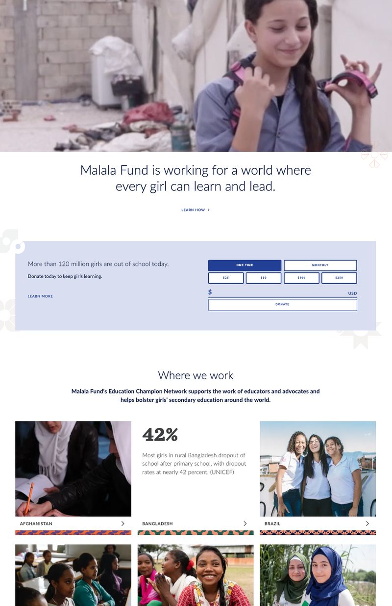
Here’s why it works:
- Impactful Visuals: The homepage features striking, high-quality video and images of young girls engaging in educational activities in school environments. These images are carefully chosen to convey both the challenges these individuals face and the hope that education brings. The faces of real girls impacted by the mission evoke empathy and make the issue of girls' education feel personal and urgent.
- Direct and Heartfelt Copy: The homepage’s above-the-fold copy is clear and direct in the organization’s mission: “Malala Fund is working for a world where every girl can learn and lead.” This statement immediately frames education as a means of empowerment and leadership, setting a hopeful and inspiring tone. This message reinforces the idea that the girls the nonprofit supports are not just passive recipients, but are instead active agents of change.
- Urgent Narrative: The copy on the homepage’s donation form highlights the urgency of the issue, sharing that "more than 120 million girls are out of school today." This frames the problem as a global crisis that requires immediate action.
- Powerful Statistics: The homepage features devastating statistics from all 10 countries where the organization operates. Statements like “47% of Ethiopian girls who start grade one do not make it to grade five” and “more than 22 million children in Pakistan are out of school — the majority of them are girls” reveal the impact of the issue and tug on visitors’ heartstrings.
- Inspiring Calls to Action: “Donate today to keep girls learning” is a straightforward call, and “the fight for girls’ education won’t be won by girls alone” suggests that visitors are absolutely essential to the movement’s success.
Overall, the Malala Fund website uses storytelling to highlight the transformative power of education. It combines gripping visuals with global data to highlight the urgency of the issue (the millions of girls who lack access to education) and the hope that progress is being made through the foundation’s work, while clear calls to action make it easy for visitors to donate.
Beneficiary Stories
The people you help are the living proof of your impact. Their stories transform abstract concepts into real, human experiences that donors and supporters can connect with and support.
But there's an art to presenting beneficiary stories respectfully and effectively. You need to:
- Maintain dignity and privacy while sharing impact
- Balance emotional appeal with professionalism
- Show both the challenge and the solution
- Include clear calls to action that connect the story to supporter involvement
Charity: Water is one organization that handles beneficiary storytelling particularly well. The nonprofit, whose mission is to provide clean and safe water to people around the world, features a variety of compelling beneficiary stories from the field on its “Our Work” page.
One story features a woman named Helen, who shares how the clean water project in her Ugandan community changed her life.
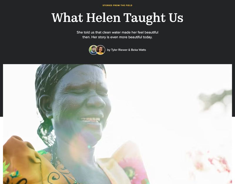
Here’s why it works:
- Emotional Connection: By focusing on Helen’s personal experience, the organization makes the issue of clean water access more relatable. Helen shares that, for decades, she spent most of her days walking and waiting to collect water. Her story is framed in a way that humanizes the statistics about global water scarcity.
- Powerful Imagery: Stunning images of Helen, her family, and her community connect readers to the clean water crisis in Uganda.
- Compelling Statistics: The story shares several statistics likely to stop an empathetic visitor in their tracks. For example, it states that the average American family of four uses 400 gallons of water per day, while Helen’s family was surviving on 10 gallons of water per day.
- Impact of the Donation: Helen’s story also ties directly into the power of donation. She shares how access to clean water improved her life — giving her more time, better health, and a stronger self image — clearly demonstrating the impact that Charity: Water's donors have made.
Your Journey and Impact
Your organization's history and achievements aren't just background information – they are proof that build trust and credibility. But many nonprofits bury these details in dense timelines or overwhelming statistics.
The key is to present your journey as part of an ongoing story that visitors can join. Think of your impact metrics not as dry statistics, but as chapters in your story of change.
For more guidance on crafting compelling nonprofit content:
- How to Write Effective Nonprofit Website Content: A Strategic Guide
- Nonprofit Testimonials: The Complete Guide to Collecting and Displaying Impact Stories
Visual Storytelling Techniques That Work
Now let's look at specific design strategies that can bring your story to life.
The Hero Section: Your Story's First Impression
Your homepage hero section is prime storytelling real estate. You have about 50 milliseconds to make a first impression, and most website visitors will leave a website in 10-20 seconds unless a compelling hero statement grabs hold of their attention.
An effective nonprofit hero section should:
- Create an immediate emotional connection through imagery
- Clearly communicate your mission
- Show the scope of your impact
- Include a clear path to engagement
Let’s take a look at a hero example from District 2 Public Health (D2PHWIC), a vital program dedicated to providing nutrition education, healthy food options, and essential resources to support the well-being of women, infants, and children in Georgia.
As part of their mission to foster healthier futures for families in need, D2PHWIC approached Trajectory to redesign their website and make it easier for eligible participants to access information and apply for benefits.
Here’s the hero section we came up with:
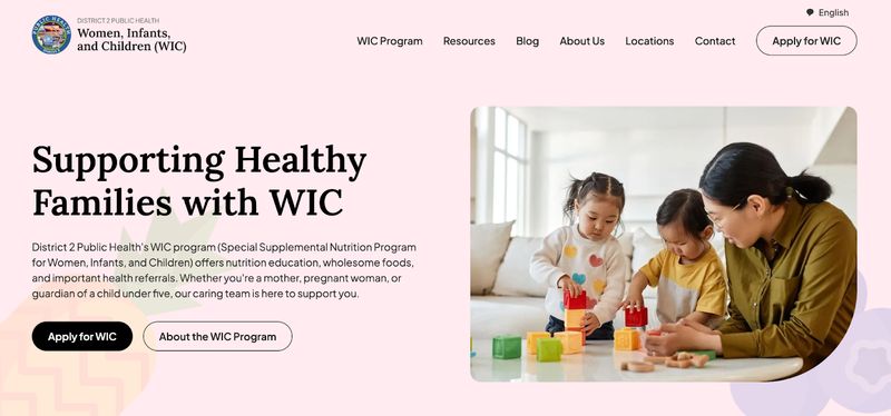
And here’s why it works:
- Direct Headline: The headline immediately establishes the nonprofit’s mission: to support healthy families with WIC.
- Clear Message: The hero’s subheading communicates the organization’s mission to provide nutrition education, healthy foods, and vital health referrals. It also clearly states who the mission is designed to help: mothers and guardians of young children.
- Vibrant Hero Image: The use of a real, colorful image of a mother interacting with her children helps humanize the content, making it relatable for visitors. It visually connects the idea of health to mothers of young children, thereby strengthening the emotional impact of the website.
- Simple Layout: The hero section maintains a clean, uncluttered layout that makes effective use of whitespace. The simplicity of the design keeps the focus on the main message, ensuring that visitors understand the purpose of the site without feeling overwhelmed by too much content. The clear typography enhances readability on both desktop and mobile devices.
- Clear Calls to Action: The black background of the main call to action–”Apply for WIC”–draws the eye while maintaining the website’s color scheme. A secondary CTA exists for visitors who aren’t yet ready to apply for the program.
Overall, this hero section is simple yet welcoming. Its headline and subheading convey the nonprofit’s mission, the featured image connects visitors to its core purpose, and its CTAs encourage action.
Impact Visualization
Raw numbers rarely tell a compelling story. The key is translating your impact into visual elements that create immediate understanding.
For example, instead of just stating "We've provided 100,000 meals," you might use an interactive visualization that helps visitors understand what that number really means in human terms.
Nonprofit Only One, an organization that inspires visitors to help solve the crises plaguing our oceans and climate, incorporates a powerful visualization of their impact on their homepage. This graphic breaks down their impact to show how each action adds up into large-scale change.
Visitors can see how many actions have been taken through the foundation, how many kilometers of ocean they foundation has protected, how much money they’ve raised for climate projects, the number of species they’ve protected, and the number of trees and corals they’ve planted.
Below, users can see specific examples of significant milestones and victories achieved as well as progress being made on different projects in various parts of the world. This data visualization is extremely accessible, featuring numbers that speak volumes without unnecessary explanation.
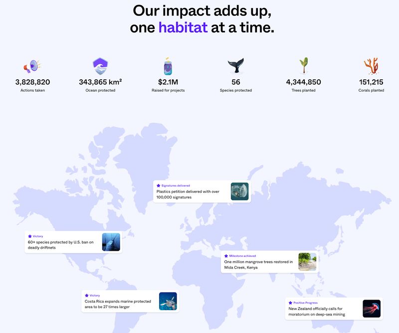
Photo and Video Integration
Visual media can make or break your story's effectiveness. In fact, 72% of donors report feeling “very likely” to make a donation to a nonprofit after seeing a video about the charity’s mission.
But many nonprofits struggle with either low-quality visuals or stock photos that feel inauthentic.
Here's what we've found works best:
- Authentic photography that shows real impact
- Video content that maintains attention
- A mix of emotional and practical visual content
- Clear organization that prevents overwhelming visitors
Photo and Video Guidelines for Maximum Impact
Here are some guidelines for selecting photos and videos that will help donors connect with your organization’s mission:
- Show Your Impact: Use images and videos that highlight real people benefiting from your cause. Donors want to see the difference their contributions make.
- Authenticity is Key: Choose natural, candid photos over staged or overly polished imagery to build trust with visitors.
- Capture Emotion: Capture moments that evoke hope, joy, gratitude, and even struggle that inspire empathy and action.
- Be Respectful: Always be sensitive to the people featured in your photos and videos and avoid stereotyping and exploitation.
- Be Inclusive: Represent the people your organization serves in a diverse, inclusive way.
- Tell a Story: Use images and videos that tell a clear story—what is the problem, who is affected, and how can donors help solve it?
- Focus on Action: Show donors how they can help, whether it’s through direct involvement, volunteering, or making a donation.
- Choose Quality Over Quantity: High-quality visuals are essential. Poor lighting, blurry images, or low-resolution videos can make your cause seem unprofessional or untrustworthy.
- Be Transparent: Show behind-the-scenes footage of your work to build credibility and trust with potential donors.
- Ensure Brand Consistency: Match your photos and videos to your nonprofit’s tone, mission, and visual identity for a cohesive and professional feel.
Keep these guidelines in mind when commissioning or selecting compelling visuals that inspire donors to take action on your nonprofit website.
For deeper insights into nonprofit visual content:
Amnesty International: A Real-Life Example of Visuals Done Right
Amnesty International is one movement that showcases striking, high-quality visuals of diverse audiences on its website to immediately grab visitors' attention and create an emotional connection. The photos often focus on real people facing human rights abuses, and they show their expressions, struggles, and emotions in a way that feels raw and intimate–but never exploitative.

This powerful visual storytelling helps make issues like abuse of human rights and police brutality feel both personal and urgent, motivating visitors to take action and get involved in the cause.
Structuring Your Website's Story Flow
Your website's structure should guide visitors through your story in a way that builds understanding and encourages action.
Homepage Narrative
Think of your homepage as the opening chapter of your story. It needs to hook visitors with an emotional connection, provide clear context about your work, show proof of impact, and guide visitors to relevant next steps.
Let’s take a look at the homepage of Oxfam Canada, a global organization that aims to end global poverty, promote women’s rights, and help vulnerable communities facing conflict and climate change.
As soon as visitors land on the foundation’s homepage, they’re hit with vibrant and compelling visuals of real women the charity has helped, along with three timely ways to make an impact: through a one-time donation, a monthly donation, or a purchase.
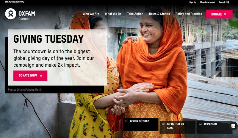
Visitors who are unfamiliar with the nonprofit’s work will find a hero message that grabs their attention by stating the core issue Oxfam is addressing — not just poverty, but inequality.
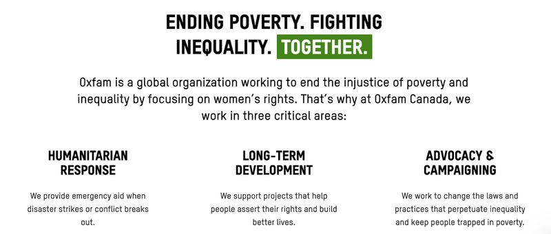
This section is straightforward, bold, and immediately tells you what the organization is about while framing the issue as something solvable. This draws visitors in and makes them feel like they can make a true impact.
Next, the narrative shifts to how Oxfam is tackling this issue, with phrases like: “We work to change the laws and practices that perpetuate inequality and keep people trapped in poverty.”
This section explains what Oxfam does — advocating for systemic change, working on the ground to provide disaster response, and supporting projects that help build a fairer, more equal world. It helps visitors understand that Oxfam isn’t just responding to the symptoms of poverty – they’re trying to tackle its root causes, which makes their work feel more impactful and worth supporting.
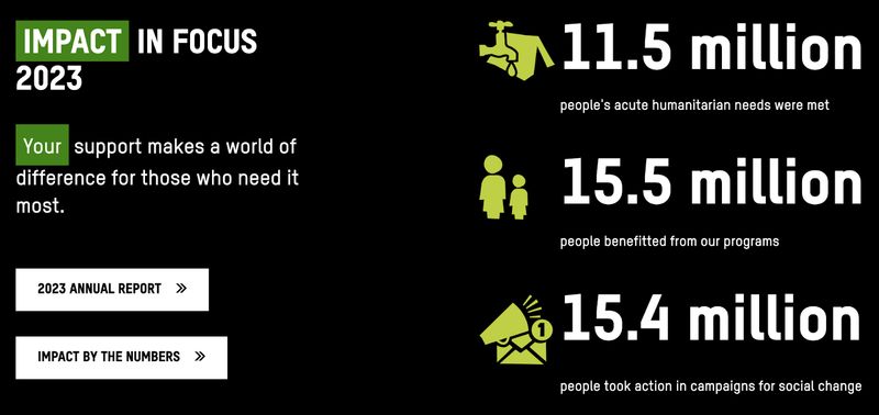
Scrolling further, visitors will see a graphic of just how many people the organization has helped, which contextualizes its impact.
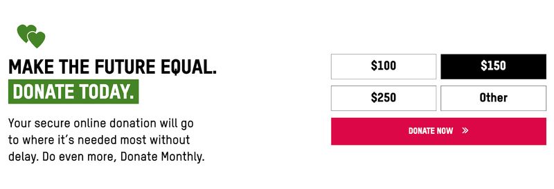
Next in the narrative flow is a simple call to action that allows visitors to immediately engage and make a donation. The donation amounts shown are carefully selected based on donor data, and while pre-set donation amounts help reduce decision fatigue and nudge donors toward making a donation, the “Other” box allows for custom donations.
A bright and colorful CTA button draws the eye, while the “Donate Now” language is clear and action oriented.
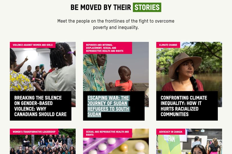
Finally, you see stories and examples of real people who are facing extreme adversity and need donor support, like “Escaping War: The Journey of Sudan Refugees to South Sudan.” These personal stories humanize the issues and bring the mission to life, showing how donations are making a tangible difference in people’s lives.
It’s not just about global statistics anymore — it’s about real people, and that emotional connection is what drives people to take action.
The narrative concludes at the bottom of the homepage with additional ways for visitors to take action beyond just direct donations, such as joining a campaign or signing up for the organization’s email list.
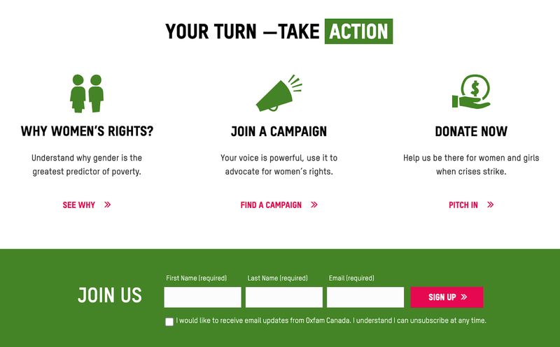
In short, Oxfam Canada's homepage works because it’s a clear, emotional, and motivating journey from explaining the problem to inviting visitors to get involved. The narrative is simple, engaging, and drives action in a way that’s easy to follow.
To learn more about structuring your nonprofit website effectively:
- How to Structure Your Nonprofit Website for Maximum Impact: A Complete Guide
- User Journeys for Nonprofit Websites: Understanding and Improving the Donor Experience
- What Should a Nonprofit Website Include (20 Must-Have Features)
- Donation Page Design: A Data-Driven Guide for Nonprofits
- 18 Proven Strategies to Increase Your Nonprofit Donations This Year
About Page Storytelling
Your About page isn't just an organizational biography – it's an opportunity to deepen the emotional connection established on your homepage.
The most effective nonprofit About pages share the founder's motivation, highlight key milestones and achievements, introduce team members as characters in the story, and connect past accomplishments to future vision.
New Avenues for Youth, a Portland-based nonprofit dedicated to preventing youth homelessness, includes all of these effective elements on its About page. It shares the foundation’s story, important milestones, and team member names alongside real images of the center and its leaders.
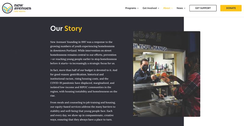
This About page is so effective because it clearly conveys the foundation’s mission and impact through a blend of heartfelt storytelling and key achievements, making it easy for visitors to connect emotionally and understand the tangible difference the organization is making.
Impact Pages That Drive Action
Your impact pages should transform statistics and accomplishments into compelling narratives that highlight the real-world impact of your work and drive action.
Share individual stories, quotes, or testimonials that show how your efforts have changed lives, and use visuals like photos, videos, or infographics to make the data more digestible. Make sure the narrative is emotional yet clear to guide visitors towards a specific action, like donating or getting involved.
The goal on your impact page is to turn visitors’ engagement into meaningful support.
For example, the impact page featured on the website of The Michael J. Fox Foundation for Parkinson’s Research shares statistics in the form of bullet points that reveal the project’s impact, such as:
“In our clinical portfolio, we have funded or sponsored scores of clinical trials in partnership with both academic and industry teams. Today, more than 15 disease-modifying interventions are in clinical trials.”
But the impact page also features a short film showing the biggest accomplishments the foundation has achieved in pursuit of a cure for Parkinson’s. This combination of text and video allows visitors to engage in their preferred manner for maximum impact.

To create more effective landing pages and measure their impact:
- Nonprofit Landing Page Best Practices: A Comprehensive Guide
- Nonprofit Website Metrics That Matter: KPIs to Track for Mission Success
Technical Considerations for Storytelling
Even the most compelling story falls flat if technical issues get in the way of telling it.
Mobile Storytelling
Over half of all people visit nonprofit websites on a mobile device. Mobile audiences grew by 16% in 2021, 7% in 2022, and 5% in 2023.
Furthermore, 94% of nonprofit websites are optimized for mobile devices. If your website isn’t optimized for mobile, you risk falling behind and losing potential donors to other organizations with similar missions.
These statistics show why your story needs to be just as compelling on a small screen as it is on a desktop device. This means adapting visual elements for mobile viewing, ensuring fast load times for all media, making donation and engagement easy on mobile devices, and testing your story flow on multiple devices.
Performance Optimization
Rich media can slow your site to a crawl if not properly optimized. We recommend:
- Compressing images without losing quality
- Using video hosting platforms effectively
- Implementing lazy loading for media
- Regular performance monitoring and optimization
There are many different tools and platforms you can use to optimize your nonprofit website – some free and some paid. Here are a few to consider:
- For image compression: TinyPNG
- For conversion tracking: Google Analytics
- For heat mapping: Hotjar
- For form analytics: Zuko
Always consider industry benchmarks when analyzing your nonprofit website’s performance. Here are some industry benchmarks that you can strive to beat:
- Nonprofit websites average 12,708 visitors each month.
- Nonprofit websites typically experience bounce rates of 60-70% (though you should aim for a bounce rate of 40% or lower).
- 44% of all visits to nonprofit websites come from organic traffic.
- 16% of website traffic comes from social media.
- 67% of donation transactions and 78% of revenue come from visitors on desktop devices.
- $137 is the average donation made on desktop devices, while $83 is the average gift made on mobile devices.
For comprehensive technical optimization:
- Nonprofit Website Speed Optimization: Why It Matters and How to Improve It
- Website Accessibility for Nonprofits: A Practical Guide
- Nonprofit Website SEO: A Complete Guide
Common Pitfalls to Avoid
Through our work with numerous nonprofits, we've identified several common storytelling mistakes:
- Overwhelming visitors with too much information at once
- Using generic stock photos that feel inauthentic
- Burying impact information in dense text
- Making donation calls to action too subtle
- Neglecting mobile optimization
So, how can your nonprofit overcome these challenges?
Overcoming Nonprofit Website Pitfalls: A Real-Life Example
Let’s take a look at a before and after example.
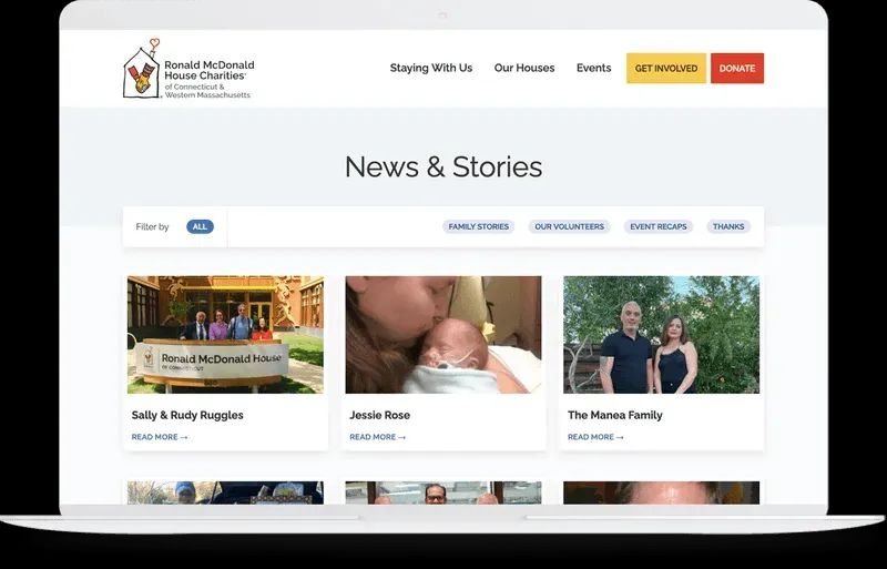
When the Connecticut and Western Massachusetts chapter of Ronald McDonald House Charities approached Trajectory about redesigning their website, their website was suffering from a number of common mistakes. Clutter was hindering families and donors from accessing their services, their content struggled to highlight what makes the chapter unique, and the site failed to adhere to the global brand voice and visuals.
Prior to the redesign, their website’s homepage showcased family after family that had been helped by the charity. While beneficiary stories are powerful, the homepage lacked the structure necessary to enable website visitors to navigate the site and access help.
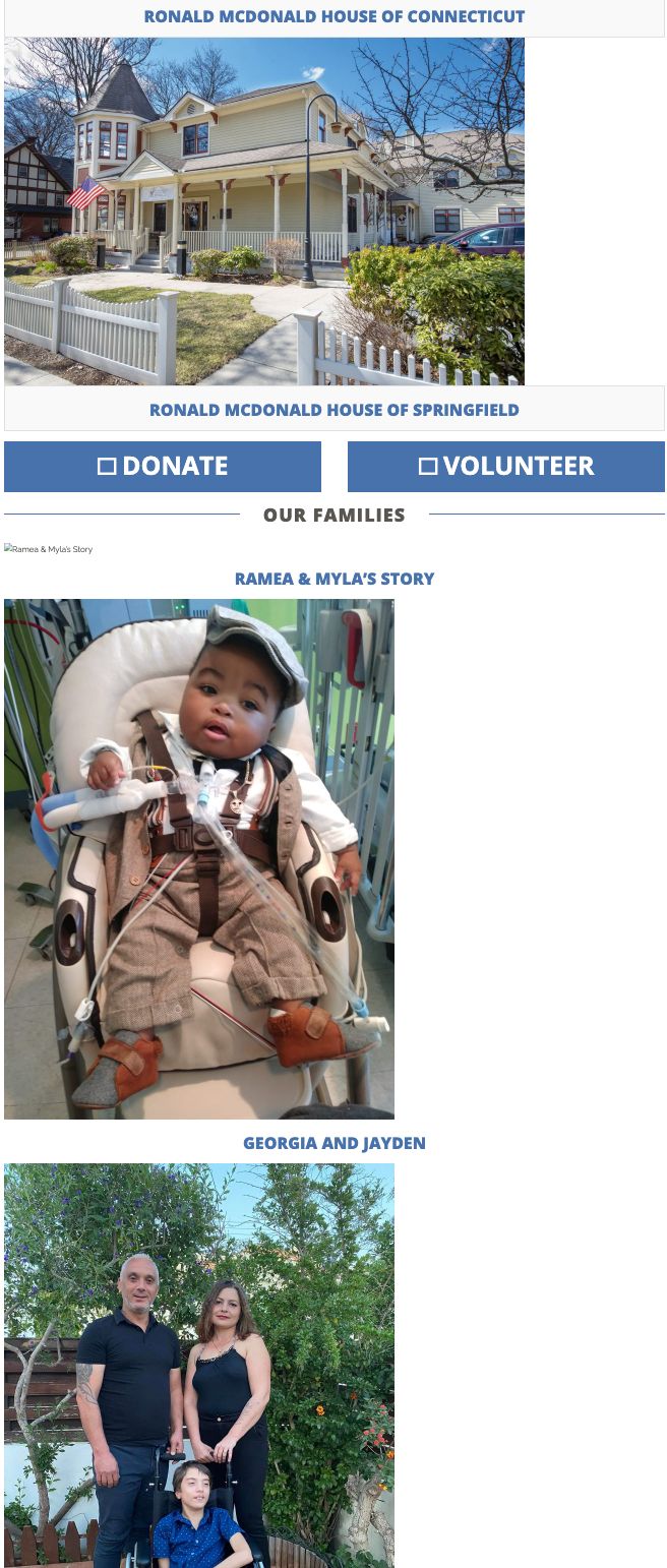
Here’s how Trajectory overhauled their nonprofit website to address these issues:
We included a robust News & Stories section to help the chapter showcase their volunteers' work and resident families in one spot, while demonstrating the nonprofit’s deep connection to their surrounding communities.
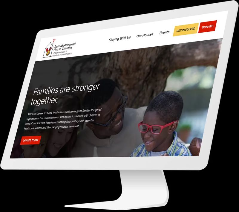
We incorporated an intuitive navigation structure that allows users to easily browse the charity's services, from housing for families in need to community programs.
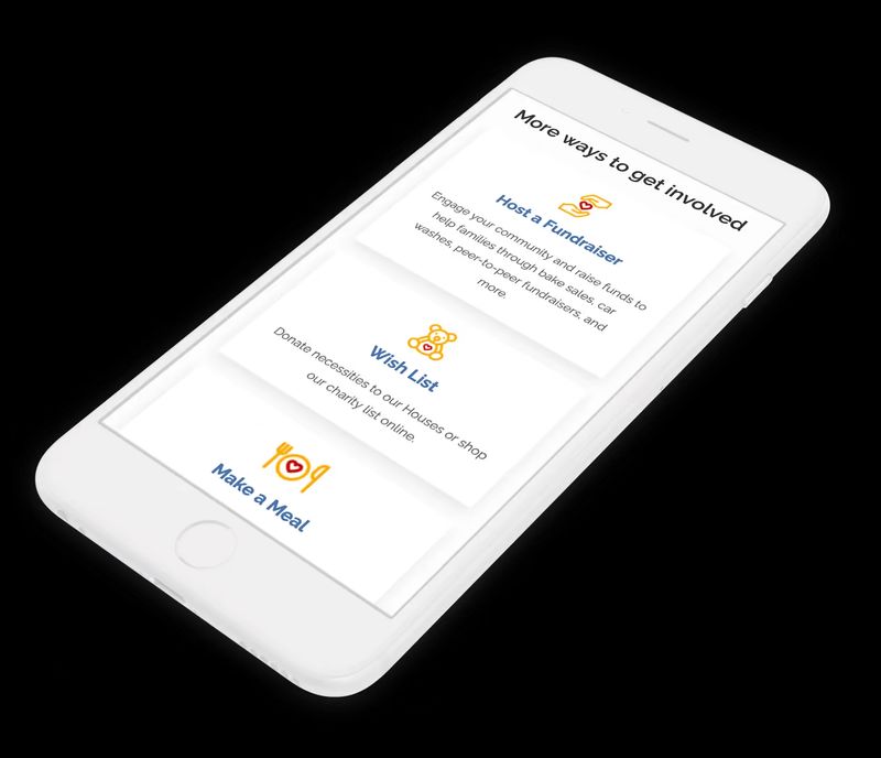
We tailored their site to promote giving and built their website on Craft, a secure content management system designed for easy and secure transactions.
Key outcomes for Ronald McDonald House Charities included:
- A friendly, welcoming website for families and volunteers
- An entirely redesigned site structure, optimized for user experience
- Conversion optimization that drives donation and fundraising initiatives
To ensure your website follows best practices:
Taking Action: Next Steps
Nonprofit web design isn’t just about aesthetics—it’s a powerful tool for telling your nonprofit’s unique story. By thoughtfully integrating visuals, clear messaging, and engaging content, you can create a digital experience that resonates with your audience and drives them to take action.
Start by assessing your current site:
- Map out your key story elements.
- Review your homepage through the lens of storytelling.
- Consider how you're measuring story effectiveness.
- Evaluate your visual content for authenticity and impact.
- Check your site's performance on mobile devices.
Remember that the right combination of storytelling and design can turn casual visitors into passionate advocates, helping you achieve your goals and expand your impact.
Ready to take the next step with your nonprofit website?