Looking for inspiration for redesigning or optimizing your nonprofit website? You’re not the only one. In the previous three years, 68% of nonprofits have engaged in a website redesign.
Whether you're starting from scratch or revamping your current site, seeing what others are doing can give you fresh ideas and help you build more effective pages that better connect with potential donors, individuals looking to get involved, and people in need of your services.
In this article, we’ll tackle the most critical elements of an effective nonprofit website before digging into some of the best nonprofit websites of 2025. The top websites on our list feature great design elements like clear navigation, compelling visuals, and easy donation processes–but that’s not all.
Want to see what really makes these websites stand out? Read on for insights and examples to inspire your own nonprofit web design.
Key Elements of Effective Nonprofit Websites
Building a successful nonprofit website requires careful planning and strategy. It's essential that you incorporate best practices and include key features in order to attract visitors, boost donations, and inspire support.
A well-organized layout, clear calls-to-action, and easy donation processes are just the start. These elements will help you create a website that not only looks good, but also works effectively to drive engagement and achieve your goals:
- Clear Mission Statement: Your nonprofit website should clearly state its purpose, mission, and values front and center so visitors can quickly understand your vision and impact. This transparency helps build trust with potential supporters.
- Easy Navigation: Make it simple for users to find what they’re looking for by organizing your website content into logical sections. Add a clear, descriptive label to each section.
- Responsive Design: Your audience will access your website on mobile devices, tablets, laptops, and desktop computers. Your layout must automatically adjust to all these devices. Be sure to prioritize content and functionality for mobile users by optimizing images and media for faster load times and making sure forms and calls-to-action are easily accessible on smaller screens.
- Prominent Donation Button: Your nonprofit website should display your donation button clearly and ensure it’s easily accessible from any page on your website. Clear instructions and a secure donation process can help build trust and encourage visitors to contribute.
- Clear Calls-to-Action: Incorporate action-oriented CTAs that encourage visitors to donate, volunteer, seek help through your organization, or advocate for your cause. Place them strategically throughout your website, including on high-traffic pages like your home page and donation page. Ensure they stand out with contrasting colors.
- Success Stories: Share impactful stories and testimonials that help visitors connect emotionally to your cause and understand the impact of your organization. Highlight the positive outcomes and tangible impact of your work to help you establish credibility.
- Engaging Visuals: Capture attention and effectively communicate your organization’s impact by incorporating photos and video into your nonprofit website that tell your story. Visuals can increase audience engagement by evoking more emotion than text alone, which can lead to greater support for your cause.
For comprehensive guidance on implementing these essential elements:
- 21 Nonprofit Website Best Practices [With Real-life Examples]
- What Should a Nonprofit Website Include (20 Must-Have Features)
- How to Structure Your Nonprofit Website for Maximum Impact: A Complete Guide
Now it’s time to dig into some of the best nonprofit websites of 2025.
Best Nonprofit Websites with Strategic Donation Pages
63% of nonprofit donors prefer to give online with a credit or debit card, while only 4% prefer donating cash. That’s why optimizing your nonprofit website to increase donations is so crucial.
The best nonprofit donation page designs are clear, simple, and emotionally engaging. They use compelling visuals and concise copy to quickly explain how donations help fulfill their mission.
Make sure your donation form is easy to fill out, with minimal fields and clear options for one-time or recurring gifts. Security indicators and transparent information help build trust and encourage donors to take action. Here are a couple of examples of great donation page design.
Mothers Against Drunk Driving (MADD)
MADD is a movement of mothers whose mission is to eliminate drugged and drunk driving. They achieve this vision by advocating for new legislation and impaired driving prevention technology in cars, establishing educational programs, and supporting victims of impaired driving.
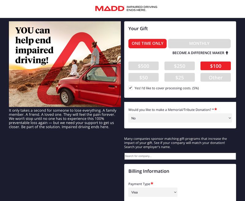
Here’s What We Love About MADD’s Donation Page Design:
- Compelling Storytelling: “It only takes a second for someone to lose everything,” shares the donation page. “A family member. A friend. A loved one. They will feel the pain forever.” This emotional plea resonates with the reader and reminds them of the very real victims of impaired driving accidents that the organization supports.
- Powerful Call to Help: The page’s impactful message that “You can help end impaired driving” empowers readers to contribute to the cause and make a difference.
- Flexible Donation Options: Donors can choose from preset amounts or specify their own donation, with the option to make a one-time or monthly donation to encourage continual contributions.
- Memorial/Tribute Donations: The page allows donors to dedicate their gift in honor or memory of someone, adding a personal touch that enhances engagement.
- Impact Statements: The bottom of the donation page shares real statistics that reveal the organization’s impact, like that it has saved nearly 475,000 lives and that it’s served over 900,000 impaired driving victims.
United Nations Population Fund (UNFPA)
UNFPA is the sexual and reproductive health agency of the United Nations. The nonprofit’s mission is to prevent maternal death and gender-based violence and ensure every young woman has the support necessary to fulfill her potential.
The organization works with partners in over 150 countries to provide access to sexual and reproductive health services with the noble goal of ending harmful practices like child marriage and female genital mutilation.
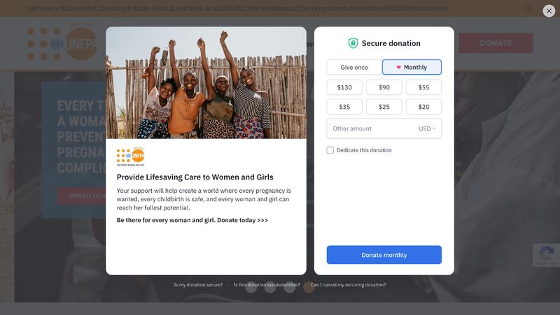
Here’s How UNFPA’s Donation Page Supports Its Mission:
- Established Mission and Benefits: The donation page clearly states how support from visitors will help the organization “create a world where every pregnancy is wanted, every childbirth is safe, and every woman and girl can reach her fullest potential.” This powerful statement instantly explains the nonprofit’s mission and shows how donations will help women and girls, while the image of smiling young women brings a sense of hope and positivity.
- Above-the-Fold Content: The donation page displays two sections – an impact statement and a donation form – side by side so both are above the fold. This reduces distractions and keeps the user experience smooth and simple to minimize the risk of form abandonment.
- Clear Call to Action: The “Donate” (if “Give once” is selected) or “Donate monthly” (if “Monthly” is selected) CTAs are simple, prominent, and action-oriented so visitors know exactly where to click.
- Customizable Contributions: Preset dollar amounts reduce friction by allowing visitors to quickly and easily select a pre-approved donation amount they can feel good about. An “Other Amount” box allows visitors to tailor their donation to their unique budget.
- Monthly Donation Option: 94% of recurring donors prefer to give monthly, so the nonprofit wisely encourages monthly donations (while still allowing for one-time donations).
- Dedication Option: A dedication box enables donors to further personalize their donation by contributing in honor of someone, with the option to write a personalized message and send a card.
- Trust Signals: 61% of website visitors have refused to make an online purchase due to a lack of visible trust badges.That’s why the quick FAQ section below the donation form is one of our favorite elements of UNFPA’s donation page. This section builds trust by addressing common security concerns that might hold visitors back from donating. When donors feel safe and confident, they’re more likely to give generously.
To optimize your own donation pages for maximum conversions:
- Donation Page Design: A Data-Driven Guide for Nonprofits
- 18 Proven Strategies to Increase Your Nonprofit Donations This Year
Best Nonprofit Websites with Compelling Storytelling
Did you know stories are remembered up to 22 times more than facts alone? Compelling storytelling is the heart of all of the best nonprofit websites. Stories turn facts and figures into emotion, making people feel inspired, moved, and empowered to take action.
In fact, nonprofit websites that incorporate compelling storytelling see donor retention rates of up to 45%, while nonprofits that do not focus on storytelling see rates around 27%. That’s because a great story can transform a casual visitor into a passionate advocate.
St. Jude Children’s Research Hospital
No one knows the importance of great storytelling better than St. Jude Children’s Research Hospital. This hospital’s mission is to advance cures and prevent catastrophic pediatric diseases through research and treatment. The kicker? St. Jude provides cutting-edge treatment at zero cost to the families.
Unlike most hospitals, the majority of St. Jude’s funding comes from the generosity of their donors. That’s why it’s so crucial that the organization's website serves as a storytelling engine that drives visitors to take action. Through increased donations, they can ensure children get the lifesaving treatment they need without ever receiving a bill for treatment, travel, or housing.
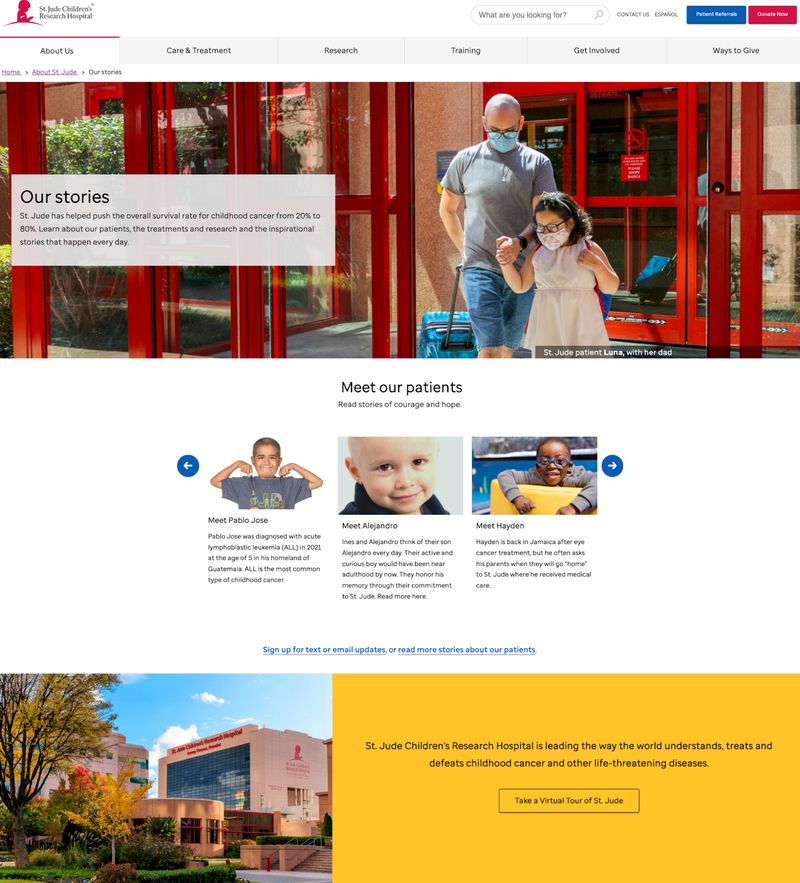
Here’s What Makes St. Jude’s Storytelling So Effective:
- Inspiring Statistics: The above-the-fold content shares that “St. Jude has helped push the overall survival rate for childhood cancer from 20% to 80%.” This incredible statistic highlights the huge impact the organization has made on childhood cancer survival rates and helps the visitor feel that their donation will make a real difference.
- Personal Patient Stories: The page shares real stories of children like Pablo Jose and Alejandro, who received medical care at St. Jude, so that visitors can connect emotionally with their personal journeys.
- Visual Content: Each story is accompanied by photos, providing a face to the narrative and enhancing the personal connection.
- Clear Outcomes: The stories highlight courage, hope, and the positive impact of St. Jude's work, demonstrating success in treating childhood illnesses and building trust with the nonprofit’s audience.
New Story
Founded in 2014 with the goal of solving the world’s housing crisis, New Story empowers families to buy land, secure home financing, and build generational wealth.
Since the nonprofit’s founding, the organization has raised over $80 million and helped more than 20,000 individuals across Latin America with housing. The nonprofit’s goal is to positively impact over 1,000,000 people by 2030.
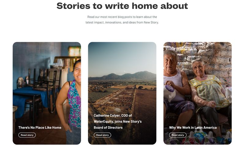
How New Story Incorporates Storytelling for Maximum Impact:
- Compelling Video Content: New Story clearly understands the power of storytelling. Right from their home page, visitors can watch a video that tells the story of how the organization helps vulnerable families secure the housing they need.
- Empowering Case Studies: The home page links to a powerful case study detailing how the nonprofit helped 941 low-income families in Etzatlán, Mexico, become first-time landowners. This case study tells a story about how female property owners can uplift communities.
- Stories of Impact: New Story features real stories from the individuals who have been impacted by the organization’s work. Each story sets the scene from the “before,” explaining how a lack of safe housing prevented them from the safety and stability necessary to thrive. For example, Gabriela’s story shares how she lived in a shelter at the top of 90 stairs. Due to her daughter’s spinal condition, she had to carry her up and down these stairs any time the family left their home.
Next comes the individual’s “new story,” or the “after,” which shares how their new home allowed them to unlock their full potential. As a homeowner, Gabriela was able to look beyond survival for the first time. She attended culinary school and now has her own business selling tamales.
These personal, powerful stories help build and nurture relationships between the organization and its donors and volunteers, which evoke emotion and generosity.
Learn more about effective nonprofit storytelling:
- How to Tell Your Nonprofit's Story Through Web Design
- Nonprofit Testimonials: The Complete Guide to Collecting and Displaying Impact Stories
Best Nonprofit Websites with Accessible Design
Nonprofit websites are all about helping people, so it’s so important to make sure everyone can use them — including people with disabilities. While more than one in four adults in the United States have a disability, only 22% of nonprofit websites are accessible for visitors with visual and hearing impairments.
Consider someone who is blind trying to read a website, or someone who can’t use a mouse trying to click around. If your nonprofit website isn’t designed to be inclusive, you could be missing out on opportunities to connect with volunteers, obtain vital donations, or provide someone with the services they need. In fact, 71% of visitors with disabilities will abandon your website if they experience accessibility barriers.
By making your site accessible for everyone — like using clear fonts, adding alt text for images, and incorporating keyboard-friendly design —you’re opening your doors to more people and showing that you care about the whole community.
Boys and Girls Clubs of America
One nonprofit that takes accessibility seriously is Boys and Girls Clubs of America. This organization's mission is to enable young people to graduate from high school as productive young adults with a plan for the future.
They accomplish this by providing safe and fun places for kids to spend their time, delivering engaging community programs, and providing trained mentors to local children in need of support.
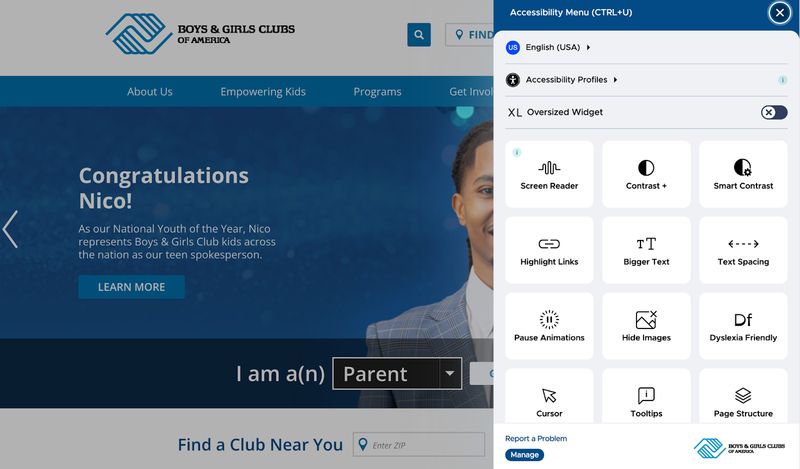
Our Favorite Elements of the Nonprofit’s Inclusive Design:
- Accessibility Menu: Perhaps most impressive is the Boys and Girls Clubs of America’s inclusion of an accessibility menu for users with disabilities. This menu allows website visitors to choose from over two dozen languages and customize their experience based on their disability type. The accessibility widget also offers a screen reader and the ability to tailor preferences to enhance text size, hide images, increase spacing, and more.
- Readable Fonts: The website uses sans serif fonts that are clear and readable to users with low vision or those reading on mobile devices.
- Appropriate Color Contrast: Low-contrast text is the biggest accessibility issue among homepages, and 81% suffer from low-contrast text. Take inspiration from the Boys and Girls Club website and ensure your nonprofit website’s text has a contrast ratio of at least 4.5:1 to meet accessibility guidelines.
- Captions: Captions and transcriptions are included for all video content so that users with auditory disabilities can still digest the information and fully participate in all interactive elements of the website.
District 2 Public Health Women, Infants, and Children (D2PHWIC)
District 2 Public Health Women, Infants, and Children (D2PHWIC) is a vital program dedicated to providing nutrition education, healthy food options, breastfeeding support, health referrals, and essential resources to support the well-being of women, infants, and children in Georgia.
The nonprofit features website design elements that adhere to web accessibility guidelines in order to cater to the diverse needs of its audience, including those with disabilities.
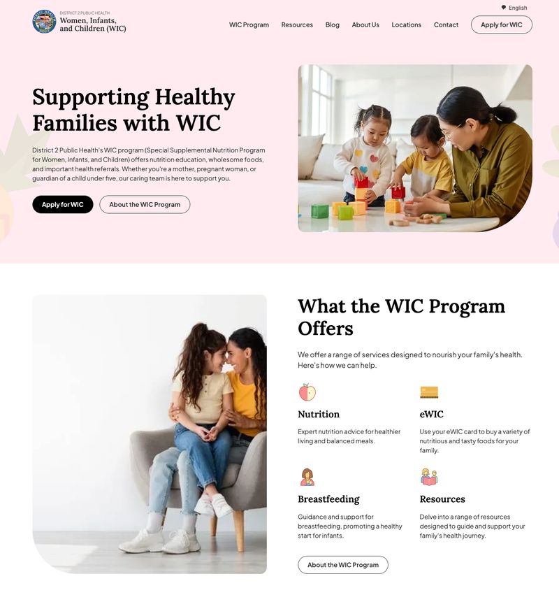
What We Love About D2PHWIC’s Accessible Website:
Intuitive Navigation: The website’s intuitive navigation and clear site structure organize information in a logical, easy-to-follow manner that enables users to quickly find the resources they need.
Clear Typography: Clear, legible typography allows visitors with visual impairments and dyslexia to read and understand the website’s content, creating a user-friendly experience for all.
High-Contrast Color Schemes: While many websites use fonts that are too small or don't have an adequate color contrast ratio between text and background, this nonprofit incorporates high-contrast color schemes to ensure the website is accessible to all. For detailed guidance on making your nonprofit website accessible:
Best Nonprofit Websites with Mobile-Friendly Layouts
When people visit your nonprofit website on their phone, they expect it to work perfectly. A mobile-friendly website isn’t just a “nice-to-have” feature anymore–it’s absolutely essential for nonprofits competing in the digital landscape.
94% of nonprofit organizations have mobile-optimized websites. If you’re one of the 6% who do not prioritize your users’ mobile experience, you will fail to reach the 87% of visitors who access nonprofit websites using mobile devices.
Designing a mobile-friendly website means prioritizing content and functionality for mobile users by simplifying navigation menus, optimizing images and media for faster load times, and making sure forms and calls-to-action are easily accessible on smaller screens.
Let’s discuss the nonprofits who offer an optimal experience on smaller devices.
Connecticut and Western Massachusetts Chapter of Ronald McDonald House Charities
For over 30 years, Ronald McDonald House Programs have provided a home away from home for parents and siblings of children who must travel to receive the medical care they need. The Connecticut and Western Massachusetts program keeps families together by providing a space for them to relax and recharge as they seek essential healthcare and lifesaving medical treatment in the area.
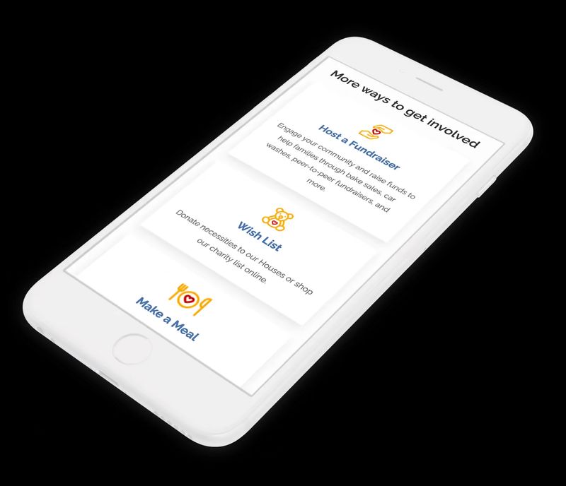
Mobile-Friendly Elements of This Chapter’s Nonprofit Website:
- Responsive Design: The website adjusts itself to fit any size screen, whether it’s a smartphone, tablet, laptop, or desktop. Everything works perfectly no matter the size.
- Simple Navigation: The website benefits from a simple yet intuitive navigation structure that allows mobile users to easily browse the charity's services, from housing for families in need to community programs. A clear menu with a logical layout makes it easy for visitors to donate or find the information they’re seeking.
- Large Buttons and Links: Tiny links and small buttons can be frustrating on a small screen. This nonprofit website utilizes sizable buttons and links with adequate whitespace around them so mobile users can easily tap them without issue.
- Optimized Images: Images are compressed to ensure they don’t slow down the site’s quick mobile load speed while remaining high quality and visually appealing.
Learn more about the organization’s website redesign process in our case study.
Education Alliance
Education Alliance is a West Virginia-based nonprofit that advocates for local children to receive a quality public education. The organization was established in 1983 with the mission to advance policies and practices that improve student achievement in public schools.
This nonprofit is 100% supported through grants and donations, which underscores the importance of its website being responsive and accessible to potential donors on all device types, including mobile phones.
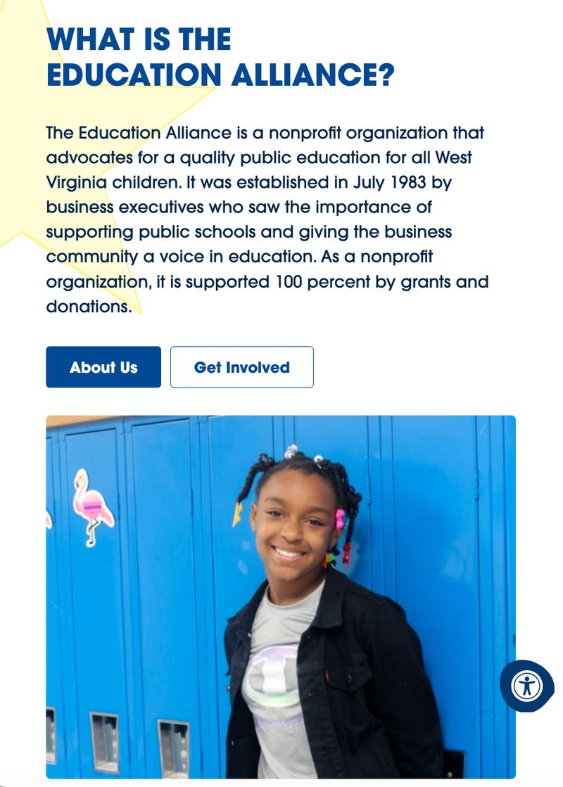
How Education Alliance Ensures Mobile Responsiveness:
- Fast Load Speed: Website visitors don’t like waiting, and 53% of mobile site visitors will abandon a page that takes longer than 3 seconds to load. Education Alliance’s website loads quickly on mobile devices, ensuring visitors won’t get frustrated and leave before they can read about the cause.
- Straightforward Navigation: The website uses a navigation drawer (also known as a “hamburger menu”) that opens a simple, clean menu with large, easy-to-click links.
- Clear CTAs: Large, brightly colored CTA buttons like “Donate” and “Get Involved” draw the eye and are easy to click on mobile screens.
- Readable Text: Education Alliance uses a clear, sans serif font that is large enough to read without zooming, and all images resize automatically. This makes the site easy to use for everyone, no matter their device.
To improve your nonprofit website's performance:
Best Nonprofit Websites with Captivating Visuals
Compelling images can really bring a nonprofit website to life. In fact, 85% of donors say compelling images and videos play a big role in their decision to give.
A high-quality photo or video can tell a story, spark emotion, and grab attention faster than words ever could. Whether it’s a smiling child, a rescued animal, or a community coming together, these visuals show the real impact of your work.
Plus, images make your site look professional and inviting, which keeps people exploring and learning more about how they can help. When it comes to nonprofit website design, a picture really is worth a thousand words.
Rotary International
Over the last 110 years, Rotary International has created a global network of over 1.2 million people who have come together to fight the world’s most persistent problems. The organization’s more than 45,000 clubs have taken on challenges like fighting disease, providing clean water, supporting education, and protecting the environment.
While the nonprofit has already made a huge impact across the world, its continued success depends on the support of volunteers who believe in its mission statement to create lasting social change.
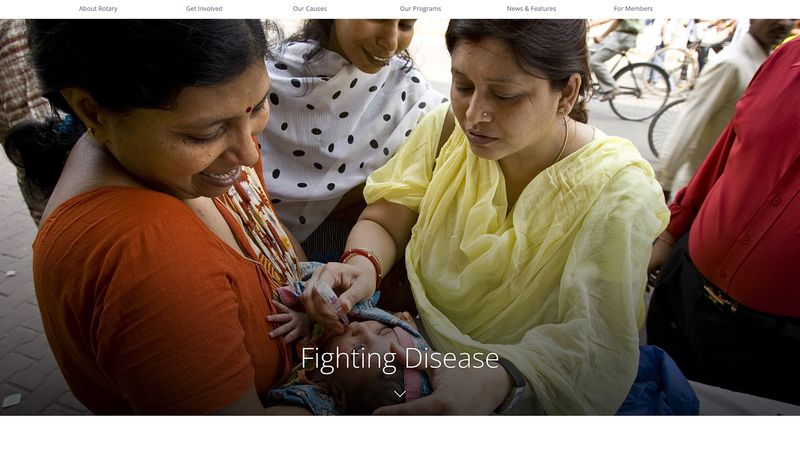
Here Is How the Nonprofit’s Imagery Brings Its Mission to Life:
- High-Quality Photos: Rotary International stays away from blurry, low-resolution images that would make their site seem untrustworthy. Instead, it utilizes vibrant, high-resolution images that match the nonprofit’s tone and visual identity and promote a cohesive and professional feel.
- Real People and Stories: The website centers real volunteers and humans who have been touched by the organization by showing behind-the-scenes photos of supporters building houses and local children receiving medical treatment. Visitors can sense when photos are genuine, and this authenticity helps build trust with potential supporters.
- Powerful Images: The selected photos capture moments that evoke hope and gratitude, such as smiling children walking home from school. They also show struggles that inspire empathy and action, like an older woman walking to obtain clean water for her family.
- Inclusion of Diversity: The nonprofit’s photos show subjects of varying ages, backgrounds, and ethnicities to represent the full range of the people its work impacts – but they remain sensitive to featured individuals and avoid stereotyping and exploitation.
- A Focus on Action: The site’s imagery reveals how donors and volunteers can help through direct involvement, such as providing dental treatment or speaking at a panel to promote peace.
World Concern
World Concern is a Christian nonprofit focused on serving the most underdeveloped and underserved communities in Africa, Asia, and Haiti. They partner with local community leaders to empower families financially and meet needs for clean water, adequate nutrition, and medical care.
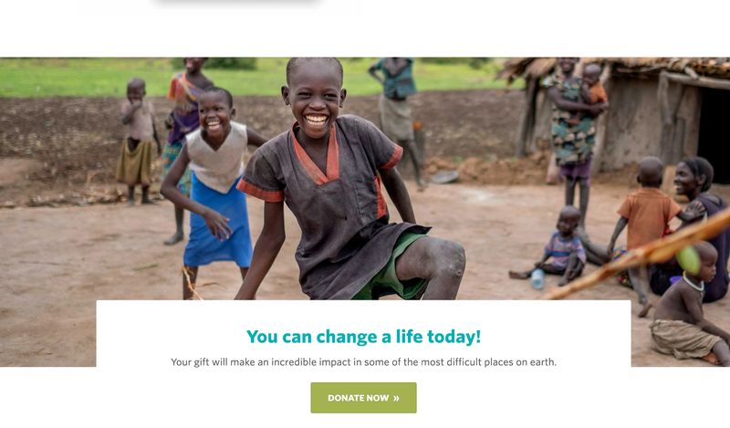
Here’s How Powerful Imagery Inspires Donations and Support:
- Emotional Photos: Images of children, families, and communities in need create a deep emotional connection between the nonprofit’s mission and its visitors, which encourages action.
- Impactful Portrayals: Pictures showing positive transformations of real people who have been helped by the organization, like thriving villages and smiling, dancing children, highlight the beneficial outcome of donations.
- Diverse Imagery: Photos of different regions and cultures make the mission feel global and inclusive.
- Professional Visuals: All images are colorful and high-resolution, with many natural, candid photos that appeal to visitors. The website avoids stock photos that feel less personal and fail to make an impact.
- Urgency-Driven Banners: Bold, compelling images paired with messages like "Give Now" emphasize immediate need and encourage donations.
For guidance on using visuals ethically and effectively:
Best Nonprofit Websites with Engaging Calls to Action
The best nonprofit websites use compelling and action-oriented calls to action (CTAs) to effectively guide their visitors toward the action they want them to take. Some common actions include donating, volunteering, requesting help, learning more about the organization’s mission, or getting involved in the cause.
CTAs should be placed strategically throughout nonprofit websites – especially in high-traffic areas like home pages and donation pages – to increase their visibility and impact.
47% of websites have a clear call-to-action button that takes users 3 seconds or less to see. Contrasting colors and ample whitespace will ensure your CTAs stand out.
Be sure to incorporate actionable language like "Donate Now" or "Join Our Volunteer Team” to capture interest and inspire action.
Redwood Empire Food Bank
Since 1987, the Redwood Empire Food Bank has been distributing food to individuals in need. They serve their community through three vital initiatives: one that addresses the nutritional needs of children in school, one that serves healthy, fresh food to senior citizens, and a third that provides food and nutrition education to five local counties in Santa Rosa, California.
In 2023 alone, the organization distributed enough food for over 24 million meals. And they couldn’t have done it without the support of over 12,000 donors and over 11,000 volunteers.
Because the food bank requires so much support to stay up and running, it’s vital that the organization’s website contains powerful and strategic calls to action that inspire monetary donations, food donations, and help from volunteers.
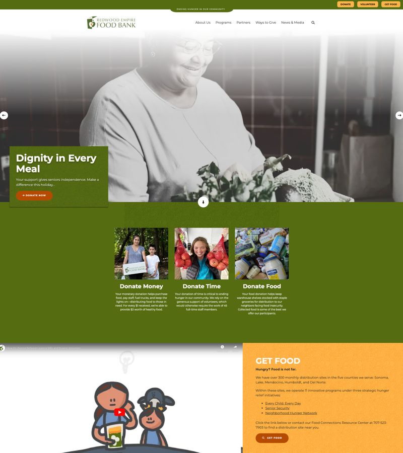
Here’s What Makes This Nonprofit’s CTAs So Impactful:
- Brief, Action-Oriented Text: The homepage CTAs are short but impactful, with action-oriented text that inspires visitors, like “Donate Now.” For individuals who have arrived at the website for food assistance, the site does not mince words. “Get Food” is brief but clear.
- Contrasting Colors: While the food bank’s CTA colors are consistent with the website’s color scheme, each button contrasts with the site’s background to draw attention.
- Consistency: Unifying colors, shapes, and fonts create a consistent brand experience across the entire website and set clear expectations for users. A predictable user experience helps visitors feel more confident interacting with a website and encourages users to take action.
- Multiple Ways to Support the Cause: The homepage clearly outlines multiple ways for visitors to interact with the site, whether they’re looking to get involved or get help obtaining food. The organization also understands that some visitors have only money or food to give, while others have only time. Their CTAs appeal to all types of people looking to get involved.
Invisible Children
Founded in 2004 with the goal of ending mass violence and child abductions, Invisible Children has spent the last twenty years implementing international awareness campaigns and establishing on-the-ground community protection programs across central Africa.
The nonprofit partners with local peacebuilders to reduce violence and reunite captives with their families. In 2021 alone, the organization reunited 92 former captives with their families.
Today, Invisible Children is leveraging their expertise and relationships to expand their work and increase their impact.
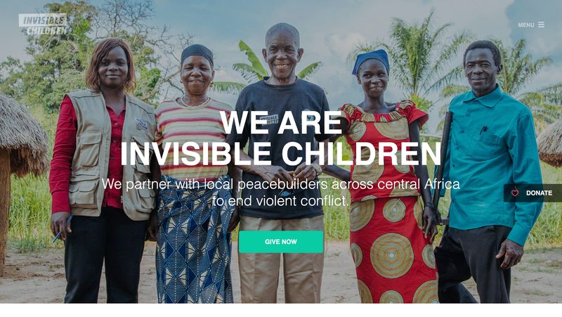
Here’s What We Like About Invisible Children’s CTAs:
- Bright Colors: The nonprofit’s CTA buttons use bright colors that grab the user’s attention and contrast with the website’s background. This ensures the buttons truly pop and makes them easy to find and click.
- Strategic Placement: Different CTAs are strategically placed throughout the website to appeal to different types of visitors. For example, users who visit the “Get Involved” page can select whether they want to “Fundraise” or “Advocate.” The contrasting buttons make it easy for people to choose how they want to get involved.
- Clear, Actionable Text: The CTA buttons don’t use vague copy like “Learn” that visitors tend to overlook. Text like “See More on the Blog” is straightforward and action oriented so visitors know exactly where they’ll be directed once they click.
- Sense of Urgency: Time-sensitive phrases like “Give Now” and “Sign Up Today” create a sense of urgency that encourages users to act.
- Sticky Donation Button: The nonprofit’s home page features a sticky “Donate” button that stays put as users scroll. This makes it easy for visitors to contribute without having to search for the button when they’re ready to make a donation.
To create high-converting landing pages and CTAs:
Common Mistakes to Avoid in Nonprofit Web Design
Now that we’ve highlighted the very best of the nonprofit world, let’s discuss some common mistakes to watch out for when redesigning your nonprofit site. These errors can confuse visitors, reduce engagement, and even discourage donations.
Avoid these common pitfalls to make your site more effective at connecting with supporters:
- Cluttered Design: Too much text or too many visuals can overwhelm visitors. Simply reducing clutter around CTAs increased one company's conversion rate by 232%. So keep your website simple, clean, and organized. Make it easy for users to find the information they’re seeking and get involved with your cause.
- Hard-to-Find Donation Button: Make donating easy with a clear, prominent button that features actionable text.
- Poorly Designed Donation Forms: Your donation page and form are crucial. After all, donations are necessary to keep your organization up and running so you can support people in need. Ask only for essential information to reduce form fields. Revenue from monthly giving is steadily increasing, so be sure to include a monthly giving option. And more than three quarters of website users say trust seals affect their trust in a website, so incorporate trust signals like data encryption notifications. You can also use A/B testing to optimize your form and increase conversion rates by up to 10%. (See more tips for nonprofit donation page design.)
- Slow Load Times: 40% of visitors will leave your website if it takes more than 3 seconds to load, so you’ll need to optimize your images and site speed. Use free tools like Google’s PageSpeed Insights to learn where to start.
- Not Mobile-Friendly: 52% of nonprofit website traffic comes from mobile phones, so make sure your website is mobile responsive.
By addressing these issues, your nonprofit can better serve your digital audience and mission.
For help planning your nonprofit website project:
- Nonprofit Website Redesign Guide
- Nonprofit Website Costs: A Complete Pricing Guide
- Nonprofit Website Development: How to Choose the Right Developer
Why Keeping Your Content Fresh Matters
Updating your nonprofit website with fresh content is crucial for staying relevant and engaging your audience. Outdated information or an inactive website can discourage potential donors by making them question your credibility.
Regular updates like recent success stories, posts about upcoming events, or highlighted new programs show users that your organization is active and committed to its mission.
Fresh content also helps with search engine rankings, making it easier for people to find your site online.
Consistently updating your site is a simple way to build trust, encourage donations, and keep your community connected.
For content strategy and creation ideas:
- How to Write Effective Nonprofit Website Content: A Strategic Guide
- Nonprofit Blog Ideas: How to Create Content Your Community Will Love
- Nonprofit Website SEO: A Complete Guide
How Tracking Your Analytics Can Make a Big Impact
You can track your nonprofit website performance by implementing analytics tools that analyze user behavior, traffic sources, and conversion data. Analytics provide valuable metrics to measure your site’s effectiveness and identify areas for improvement.
For example, if you notice people leaving your donation page before contributing, you can simplify your form or incorporate autofill to increase conversions. By regularly reviewing your analytics and studying your trends, you can see what’s working – and what isn’t – and make data-driven decisions to improve user experience and engagement.
Tools like Google Analytics and Kissmetrics can help you track important data, like how visitors find your site, which pages they spend time on, and where they drop off.
Heat mapping tools like Hotjar and Lucky Orange can provide you with a visualization of how users interact with your website so you can see where to focus your efforts.
And popular form analytics tools like Zuko and Contentsquare can show you how visitors view your form, whether they start to fill it out, and when they abandon it so you can make necessary improvements.
To measure and improve your nonprofit website's performance:
- Nonprofit Website Metrics That Matter: KPIs to Track for Mission Success
- Nonprofit Website Audits: A Comprehensive Guide for Evaluation
Tips to Keep Your Nonprofit Website Running Smoothly
Regular maintenance is essential for ensuring the effectiveness of your nonprofit website. Follow these best practices to ensure your site stays up-to-date, secure, and user-friendly for all visitors:
- Frequently Update Software and Plugins: Keep everything up-to-date to avoid security risks that could damage your reputation and your donors’ trust in you.
- Test Forms and Links: We’ve said it before and we’ll say it again – your donation page and form are crucial. It’s vital that all forms, links, and buttons work properly.
- Refresh Content: Replace outdated information and keep your site current and search engine optimized so visitors can find you and trust in your mission.
- Monitor Speed: Continually optimize your website to ensure fast load times.
For ongoing website management and security:
- Nonprofit Website Maintenance Guide
- The Complete Guide to Nonprofit Website Security
- Do Nonprofit Websites Need a Privacy Policy? A Complete Guide
Elevating Your Nonprofit's Online Presence
The best nonprofit websites in 2025 show us how great design, engaging content, and smart strategies can inspire action and grow support. These 12 examples prove that combining creativity with user-focused features — like easy navigation and strong calls-to-action — makes a big difference.
Ready to take your nonprofit website to the next level? Start by learning from these standout examples and focusing on performance upgrades like fast load times, fresh content, and mobile-friendly design. Your website can be the key to driving real impact and connecting with supporters who believe in your mission.
Additional resources for nonprofit organizations: