In our 30-plus years of partnering with nonprofits of all sizes, one thing has become abundantly clear: simply having a worthy cause isn't enough to inspire support.
It truly breaks our hearts to see amazing nonprofits struggle because they don’t realize this reality.
It's easy to assume people will automatically connect with a cause, but the truth is that we're all driven by emotions. Often without even realizing it. Factors like trust, curiosity, and social proof greatly influence our choices.
Think about it. When you land on a website, what compels you to stay, donate, or get involved? It's usually more than just the cause itself—it's how the information is presented and the emotions it stirs up.
That’s precisely why we studied some of the best nonprofit websites, looking for common threads. By the end of this article, you’ll have a handy checklist of essential features for nonprofit web design and gain a better understanding of how they contribute to your nonprofit's growth.
Foundational elements of a nonprofit website
Building a successful nonprofit website takes thoughtful planning and strategy. To engage visitors, increase donations, and drive support, you need to follow best practices and have the foundational elements in place.
Mission and purpose
Your nonprofit website must clearly state its purpose, mission, vision, and values. It helps build trust, creates transparency, and helps potential supporters understand the organization's purpose and the cause it champions. The mission statement should be front and center. Your statement should clearly describe the goals and issues your nonprofit organization strives to address.
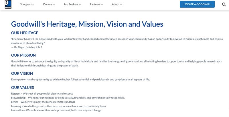
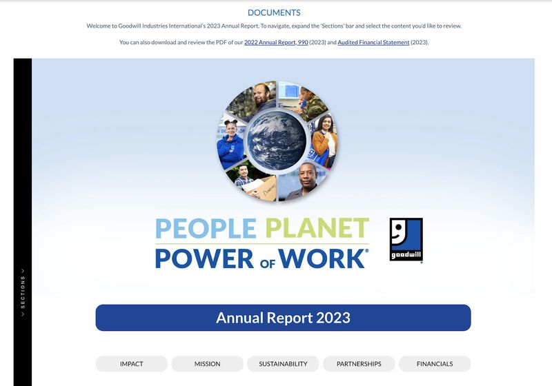
It's also crucial to highlight why your work matters and the impact it has. Provide specific examples or success stories showing how your nonprofit made a real difference to people or communities. It reinforces the organization's credibility and helps visitors emotionally connect with the cause.
Clear content structure
Organizing website content into logical sections provides a smooth user experience. Common sections include "About Us," "Our Programs," "Get Involved," "News and Updates," and "Contact." Each section should have a clear, descriptive label, making it easy for visitors to navigate and find what they need.
For instance, the "About Us" section could give an overview of the nonprofit's history, mission, and team, while "Our Programs" details the various initiatives and services offered. The "Get Involved" section should prominently feature ways for visitors to contribute, like volunteering, donating, or advocacy campaigns.
Here’s a great example from the Make-A-Wish Foundation. Their content’s super organized and easy to navigate.
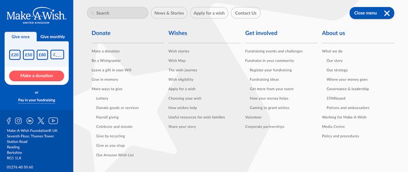
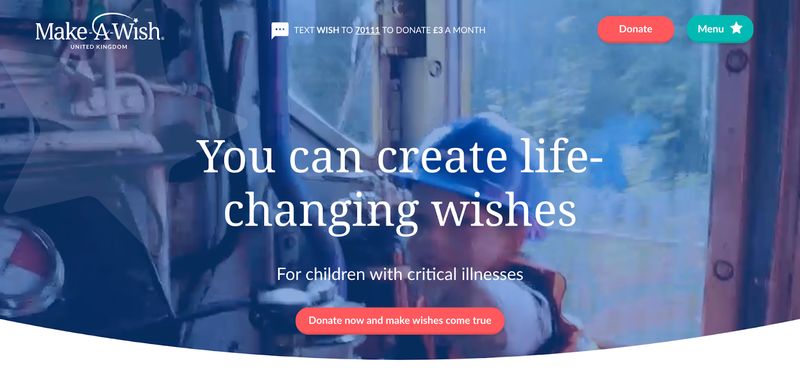
The best part is that all this information stays tucked away until you expand the menu, so first-time visitors don’t feel overwhelmed. When you first land on the site, you only see the header image, a donate button, and a menu button.
Easy navigation
Navigation is the perfect segue from the previous point about clearly structured content. Steve Krug, Author of "Don't Make Me Think," says: "Navigation is the backbone of any website, and a well-designed navigation system can make or break the user experience."
We wholeheartedly agree with this quote. Having a user-friendly navigation menu helps visitors find information easily. You should display your menu prominently and organize it logically. Here’s an excellent example from Feeding America: they’ve clearly labeled and organized the navigation.
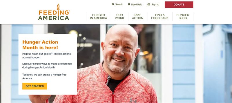
Incorporating breadcrumbs can also improve user experience on your site—especially if you have a lot of content. It helps your users navigate the site by showing them where they are in the site hierarchy. To further aid content discovery, consider including a sitemap showing the entire website structure. The sitemap helps website visitors and search engines find specific pages or sections.
Search bar
A search bar is one of those features that not every nonprofit website needs, but it is a must-have if you have a content-heavy section. The search feature helps visitors find specific information or content quickly without navigating through multiple menus or pages. Make sure you display the search functionality prominently and make it easily accessible from relevant pages. You can see this in action in the below example.
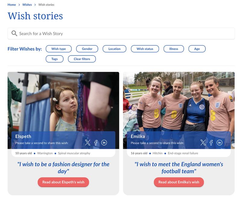
Optimizing search results for relevance and accuracy is crucial when implementing a search function. You can do this by incorporating advanced search algorithms, filtering options, and suggestions based on user input. For example, if a website visitor searches for "volunteer opportunities," the search results should display relevant results, like upcoming events and signup forms, not pages about fundraising or annual reports.
Responsive design (mobile-friendly)
According to Statista, mobile devices accounted for 60% of all global web page views in 2024. It emphasizes the importance of a responsive nonprofit website design.
Your audience will access your website on mobile devices, tablets, laptops, and desktops. You'll want a responsive web design so the content and layout automatically adjust to all these devices. When designing a responsive website, it's crucial to prioritize content and functionality for mobile users. This may involve simplifying navigation menus, optimizing images and media for faster loading times, and making sure forms and calls-to-action are easily accessible on smaller screens.
User experience design (UX)
Designing your nonprofit website with the user in mind is crucial for creating a positive user experience. Adopting a design thinking approach can significantly enhance the user experience of a nonprofit website. Design thinking involves empathizing with the target audience, defining their needs and pain points, ideating solutions, prototyping, and continuously testing and iterating based on user feedback.
Focus groups and user interviews can also provide invaluable insights into how visitors perceive and interact with the website. These sessions can uncover usability issues, content gaps, or areas for improvement that may not be apparent to the organization.
Incorporating accessibility best practices is also crucial for ensuring an inclusive experience for users with disabilities. This includes providing alternative text for images, ensuring proper color contrast ratios, and enabling keyboard navigation for those who cannot use a mouse.
Regularly conducting usability testing, either through moderated sessions or remote testing tools, can help identify friction points and areas where users struggle. This data can then inform design and content decisions, leading to a more intuitive and user-friendly experience.
For deeper insights on optimizing user experience and accessibility:
- User Journeys for Nonprofit Websites: Understanding and Improving the Donor Experience
- Website Accessibility for Nonprofits: A Practical Guide
Conversion elements
Donation button
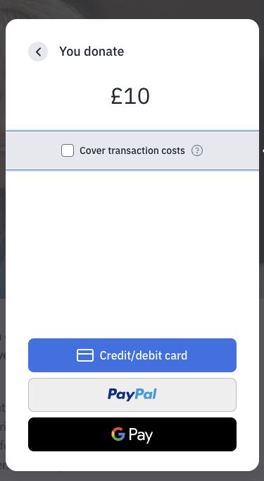
The donation button should be prominently displayed and easily accessible from any page on the website. Clear instructions and a secure donation process can help build trust and encourage visitors to contribute.
Offering multiple payment options, such as credit cards, PayPal, or digital wallets, can cater to the preferences of different donors. For example, the donation page could feature a simple, three-step process: "1. Select Amount, 2. Payment Information, 3. Confirm Donation."
To maximize your donation strategy and optimize conversion:
- Donation Page Design: A Data-Driven Guide for Nonprofits
- 18 Proven Strategies to Increase Your Nonprofit Donations This Year
Email list sign-up form and pop-ups
Encourage visitors to sign up for your newsletter so you can convert casual visitors into loyal customers.
It opens up a new communication channel to inform your audience about your purpose, solicit donations, and send event invitations.
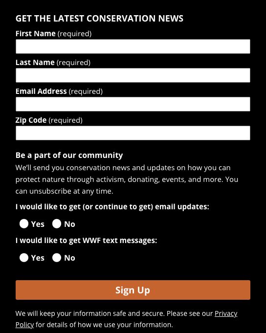
Make the sign-up process simple, with minimal form fields to improve conversion rates. Here’s an example of a minimalistic newsletter sign-up form.

If you have a more complicated organizational setup, it doesn't hurt to ask for more details. For instance, WWF asks for the zip code in their newsletter sign-up form.
You can also have promotional pop-up ads. Here’s an example from the Charleston Animal Society.

Clear CTAs
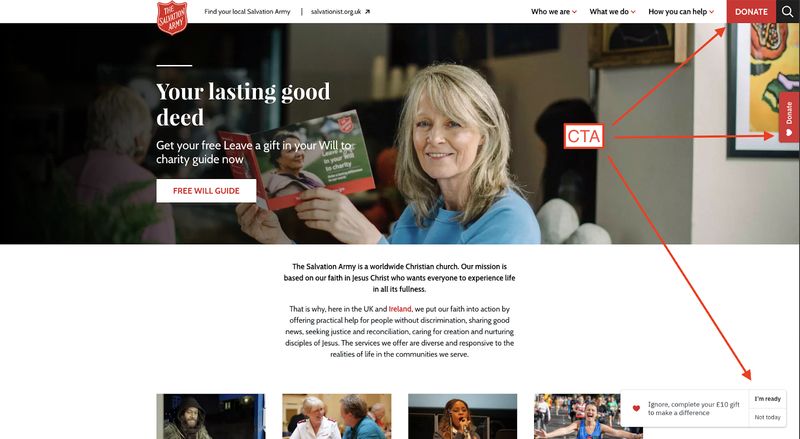
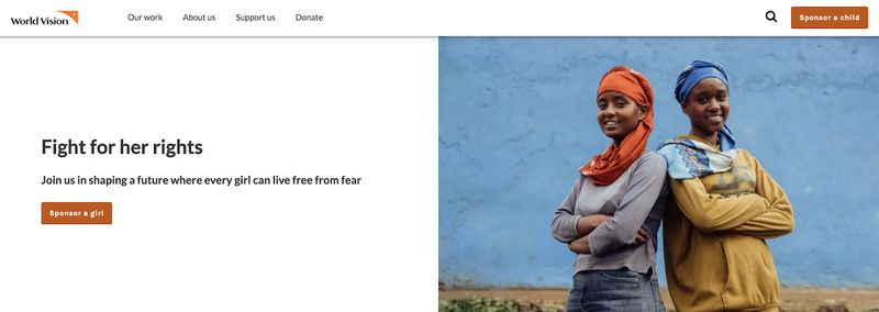
Use compelling and action-oriented calls-to-action (CTAs) to guide visitors towards desired actions effectively. The action can be donating, volunteering, or advocating for the cause. Placing CTAs strategically throughout the website, especially on high-traffic pages, can increase their visibility and impact. Make the CTAs stand out with contrasting colors or designs. Use action-oriented CTAs like "Donate Now," "Join Our Volunteer Team," "Sign the Petition," or “Support Our Cause.”
Here’s an example from World Vision where a big brown CTA button clearly communicates the action the visitor should take (Sponsor a child). They’ve done a great job with the placement, contrasting color, and CTA.
Testimonials and success stories
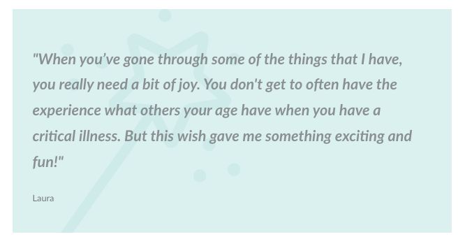
Share inspiring stories and testimonials from beneficiaries, volunteers, or donors to help visitors understand the impact of your organization. Use multimedia elements, like videos, images, or quotes, to make these stories more memorable. Highlight the positive outcomes and tangible impact of the organization's work to reinforce its credibility. For example, the testimonial section could feature a video of a beneficiary sharing how the nonprofit's services improved their lives. If you can’t get a video, a simple quote will do, like the example from Make-a-Wish Foundation.
For comprehensive guidance on collecting and showcasing impact stories:
People involved (leadership)
Introducing the organization's leadership team and board members is a crucial trust-building factor for your nonprofit website. Highlighting their expertise, experience, and commitment to the cause helps foster transparency and credibility. Sharing detailed bios and profiles of these individuals can reassure potential donors and supporters about the integrity and competence of your organization. By showcasing the qualifications and dedication of your leadership, you create a sense of trust and reliability, which can significantly improve conversions and encourage more people to support your mission.
Secure donation processing
Implement secure payment gateways and encryption protocols for online donations. Comply with PCI DSS standards for handling financial data. Display trust seals and security badges to build donor confidence. Robust security measures protect sensitive financial information and instill trust in donors, encouraging more contributions.
Engagement elements
Clear branding
Establish a consistent and recognizable brand identity. Use the organization's logo, colors, and visual elements consistently across all platforms. Ensure the branding aligns with the nonprofit's mission and values.
Upcoming events calendar
Showcase upcoming events, fundraisers, or campaigns prominently. Allow visitors to easily view event details and register or purchase tickets directly from the website. Integrate with online event management tools for seamless coordination.
Storytelling
Adopt a storytelling approach to engage and connect with visitors emotionally. Share real-life stories, experiences, and impact narratives from beneficiaries, volunteers, or donors. Use an authentic and relatable tone to resonate with the audience.
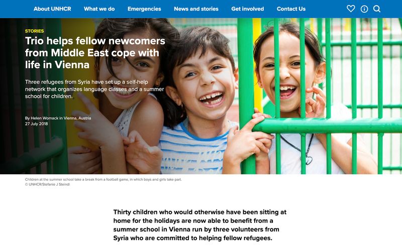
The United Nations High Commissioner for Refugees (UNHCR) uses individual stories to showcase their work and impact. These personal stories humanize the refugee experience and create an emotional connection with the audience. By focusing on specific people,
UNHCR makes the large-scale refugee crisis more relatable and understandable. This approach helps to challenge assumptions and stereotypes about refugees while demonstrating the organization's impact.
To enhance your storytelling and content strategy:
- How to Tell Your Nonprofit's Story Through Web Design
- How to Write Effective Nonprofit Website Content: A Strategic Guide
Social media integration
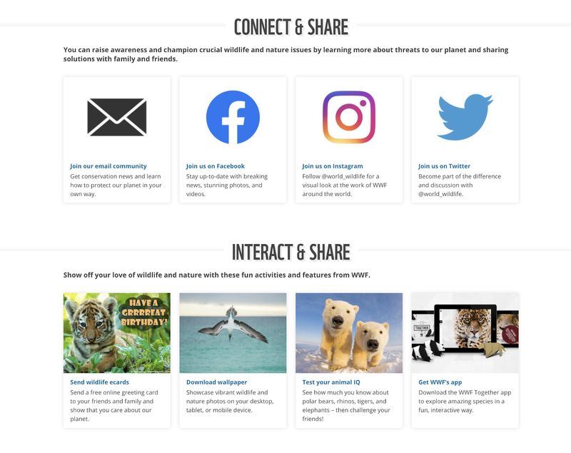
Integrate social media feeds and sharing buttons on your website to visually show your work and people. Encourage visitors to follow and engage with the organization on social platforms. Leverage social media to amplify the nonprofit's message and reach new audiences. Here’s the World Wildlife Fund (WWF) putting it into action.
Blog or news section
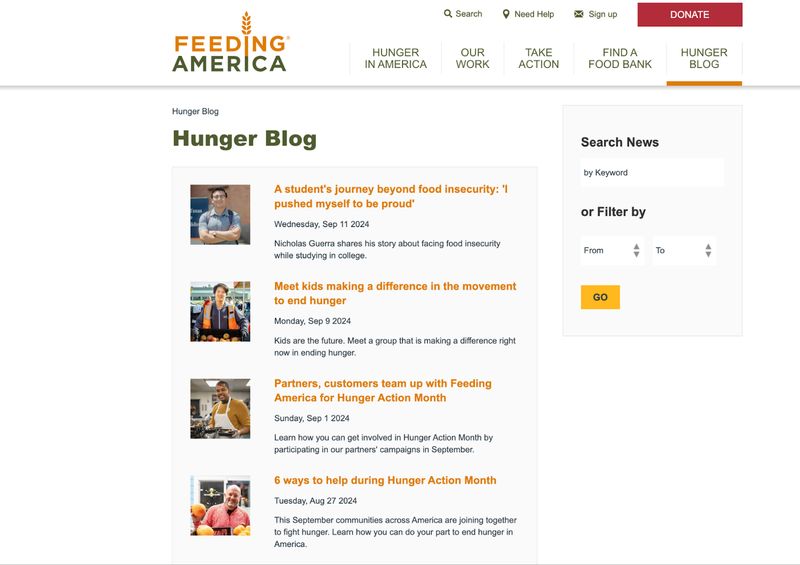
Maintain a regularly updated blog or news section on your nonprofit website. Provide updates, news, and insights related to the organization's work. Share success stories, announcements, and thought leadership content. Encourage engagement and discussion through comments or social sharing features. Consider setting up an editorial calendar to plan and organize your posts. Include a search and filter option on your blog to make it easier for visitors to find the information they need. Here’s a good example from Feeding America.
For content ideas and blog strategy:
Legal compliance, and inclusion
Privacy policy and cookie consent
Clearly outline the organization's data privacy practices. Provide information on how user data is collected, used, and protected. Make sure you comply with local privacy laws and regulations (e.g., GDPR, CCPA).
Maintaining transparency about data practices builds trust with website visitors and donors. Use clear, concise language to explain privacy policies.
For detailed privacy policy guidance:
Press and media kit
A well-organized press and media kit can help nonprofits gain valuable media exposure, increasing awareness and credibility. Positive media coverage can attract new donors, volunteers, and partners. Include press releases, fact sheets, and high-resolution logos. Provide contact information for media inquiries. Share recent media coverage and mentions.
Accessibility
Prioritizing accessibility demonstrates inclusivity and allows individuals with disabilities to fully engage with the organization's mission and content. It also helps avoid potential legal issues. Ensure the website meets accessibility standards (WCAG, ADA, etc.). Provide alternative text for images and multimedia. Enable keyboard navigation and support for screen readers and other assistive technology.
Multilingual support
If you serve a diverse community, make your website content available in different languages. Provide the option to choose a language using translation features. Make sure the translations are accurate and culturally appropriate. Supporting multiple languages helps you reach more people and promotes inclusivity.
Growth enablers
Retargeting ads
Implementing retargeting scripts will allow you to launch campaigns to reengage website visitors. You can then use targeted ads to promote specific campaigns or initiatives. Leverage retargeting to nurture potential donors or volunteers. Retargeting allows nonprofits to stay top-of-mind and convert interested visitors who may not have taken action initially.
Analytics
Implement web analytics tools (e.g., Google Analytics, Plausible) to track website performance. Analyze user behavior, traffic sources, and conversion data. Use insights to inform data-driven decisions and optimizations. Analytics provide valuable metrics to measure the website's effectiveness and identify areas for improvement.
Speed optimization
Make sure your website loads quickly on various devices and connections. Optimize images, minify code, and leverage caching techniques. Monitor and improve website speed for a better user experience. Slow-loading websites can lead to high bounce rates and lost opportunities, making speed optimization crucial. If you're using a platform like Webflow, it should load quickly without needing much manual optimization. But if you're using a website builder like Elementor, you'll have to do more manual optimization. We have an article comparing Webflow and Elementor if you want to learn more about these builders.
To improve your website's performance:
SEO (search engine optimization)
Search engine optimization involves tailoring your website's content and structure for better visibility on the search engine results page. You can do this by doing keyword research and adding relevant keywords to your content. SEO also involves building high-quality backlinks and leveraging local SEO tactics. An effective SEO strategy can increase your organization's online reach and discoverability by driving more organic traffic to your site.
For comprehensive SEO strategies:
Additional considerations
Content management system (CMS)
Choose a user-friendly CMS (e.g., WordPress, Webflow) for content management. It should be easy for your non-technical staff to update website content. Pick a secure, scalable CMS that integrates with your tech stack. A user-friendly CMS empowers your staff to keep the website fresh and up-to-date without relying heavily on developers or IT resources.
To choose the right platform and development partner:
- Webflow for Nonprofit Websites: A Complete Guide
- Nonprofit Website Development: How to Choose the Right Developer
Integration with CRM (customer relationship management) or donor management software
Connect your website to your CRM or donor management systems. It will simplify data sharing and synchronization and improve donor tracking, communication, and relationship management. Integrating systems creates a comprehensive view of donor interactions and eliminates data silos. It will enable you to make more informed decisions.
Online store or merchandise (if applicable)
If your nonprofit sells merchandise, include an online store or e-commerce section on your website. Showcase products, accept secure payments, and manage inventory. Integrate with shipping and fulfillment providers. An online store can generate additional revenue streams and promote your brand. Share relevant statistics or success stories if available.
Interactive tools or calculators (if relevant)
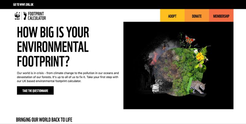
Develop interactive tools or calculators relevant to your organization's cause. Use these tools to educate, engage, and provide value to website visitors. Examples: carbon footprint calculator, impact calculator, etc. Interactive elements can enhance the user experience and deepen visitors' understanding of your mission. Here’s WWF’s carbon footprint calculator.
Membership features (if relevant)
If your nonprofit offers a membership program, your website should have a login feature and member area. Membership feature allows members to access exclusive content, track their donations, and stay updated with the latest news and events. A member dashboard can enhance the user experience by displaying personalized information such as membership status, renewal dates, and special offers.
Conclusion
Your nonprofit website design can be a powerful tool to advance your cause if it incorporates basic features, conversion strategies, engagement features, and growth enablers. By ensuring legal compliance, accessibility, and inclusivity, you create a platform that builds trust and broadens your reach. Together, these elements create a platform that not only informs but also inspires action and support.