Homepages are often wrapped up in a lot of excitement—and for good reason. Designers and creatives usually tackle crafting the homepage first, using the homepage as a preliminary staging ground for a company’s core messaging. For our clients, unveiling a newly designed homepage is often an exciting opportunity to get a first glimpse at their brand’s new digital face.
Homepages are crucial for establishing first impressions, and they’re necessary for helping site visitors find their way to the rest of your website. If you get your website’s homepage design right, users will come away from their initial interactions with your company understanding who you are, what you offer, and how you’ll solve their problems.
Your website’s design is responsible for 94% of consumers’ first impressions of your business, and most spend an average of 5.94 seconds looking at the top of your homepage. With only 50 milliseconds standing between your website and your user’s initial opinion, the homepage is a pivotal frontier for your digital success.
That’s why the homepage is the first item we tackle when working with a customer to redesign their website and hone their digital brand. You can read more about our redesign process and timeline here.
Here’s how we do it.
The Basics: How are homepages used, and are they that important?
We—like most web design teams—work with clients on building a homepage first. By far, homepages still receive the vast majority of views on most websites. They’re responsible for creating the first impression of your company and brand—and, generally, a homepage distills your company’s main message and selling points succinctly.
Homepages should drive home a clear company message while providing enough information that visitors can find what they’re looking for as quickly as possible
When a user arrives on your homepage, it must serve as an informative and enticing gateway for the rest of your site, distilling your company’s message and providing waypoints through which users can intuitively access and move to other pages with more specific information.
Every piece of content offered on a homepage must answer, in some way, your customers’ questions. Most users don’t read a homepage from top to bottom, and most will quickly scan around to find what they’re looking for—probably in a nonlinear fashion. Usually, visitors read pages in a f-shaped pattern, as shown in the heat map below.
And while we may be able to predict which areas of your homepage users will look to first, each component of your design must communicate what you do as a company, what message you have for consumers, and how you’ll address their concerns.
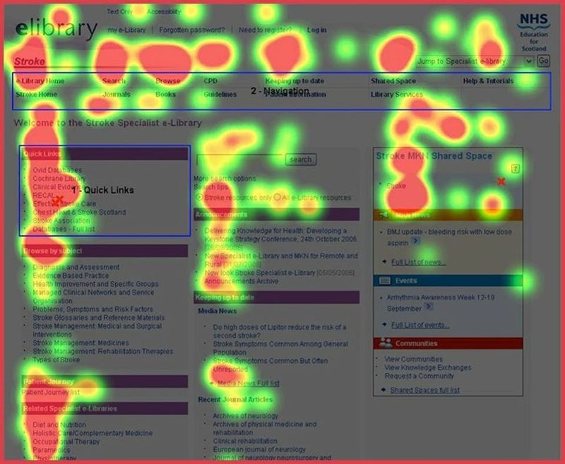
When first visiting your homepage, users will analyze information in an f-shaped pattern.
In short, a homepage should synthesize every aspect of your website to give users a clear and distinct picture of your company. And there are certain design and content conventions of a homepage—like a hero message or a call to action—that achieve this goal as efficiently as possible.
To understand how all of this works, we’ll open the hood and break down the basic structure, design and content of a homepage.
Breaking Down the Homepage
A website’s homepage design can include countless variations of design and content, but a few basic components structure a homepage’s foundation.
Hero Message
The hero message is the first thing you see when you visit a website’s homepage.
Hero messages, which we’ve written about on our blog, need to be eye-catching, visually appealing, and laser-focused to deliver your company’s core messaging and branding. Usually, they feature a headline with subtext, a button that calls the visitor to action, and appealing photography or design that adds visual interest but doesn’t overwhelm.
It takes less than 50 milliseconds for a user to form an opinion about a site, and more than 75% of users admit to judging a company’s credibility solely on their site design. Hero messages are responsible for getting all of this done in a split second. Users need to know they’re in the right place, and they need to know you can give them what they’re looking for.
As a general rule, after capturing your user’s attention, the hero message must fully achieve communicating your business within the first 10 seconds a user is on your page. After all, 55% of people admit that they’ll leave a website in less than 15 seconds if it doesn’t sustain their attention or address their search intent.
To do this, an effective hero message should explain who you are as a company, what you do, and why your visitor should care. The hero message should give the user an immediate sense of the services you provide and—crucially—whether you’re able to address their needs as consumers.
Carefully crafted, an effective hero message will establish credibility and trust between you and your website’s visitor, help users to determine whether your site or services will be useful to them, and, importantly, entice your visitor to perform your desired call to action.
This is key for conversion. Your website’s objective is likely to turn site visitors into leads and customers. That process of “conversion” starts on your homepage, and the hero message’s ability to entice visitors to perform an action—to fill out a form or contact the company, for example—is a crucial step in lead generation.
Ultimately, your hero message should provide the most distinct and relevant information to satisfy whatever user intent you want to meet. What’s that mean? If you’re a software company using your website as a primary driver for sales and discovery, your hero message should be focused on introducing and selling your software.
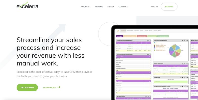
Excelerra Software's hero message directly addresses their product.
This is the strategy we employed with Excelerra, a client who provides CRM software. Their hero message tells users exactly what problems their software solves while directing visitors to learn more and get started.
Leading Content Block
Generally, the leading content block describes the written content that immediately follows your hero message. Leading content blocks can serve a variety of purposes, but generally they add color to the messaging you’ve established in the hero and speak to your company’s core differentiating factors.
The leading content block is place to show what sets your company apart from the competition and why you’re the right choice for your visitor.
The leading content block should continue to hone your company’s message while providing more distinguishing content, like how you contrast with similar businesses. Often, the leading content block is an important place to lay out your company’s points of difference.
Sometimes a leading content block can work directly with a hero message to add visual continuity to the design of your website and provide further stylized and branded writing, as is the case with Oasis Hydration’s website, a client of ours from the Atlanta area.
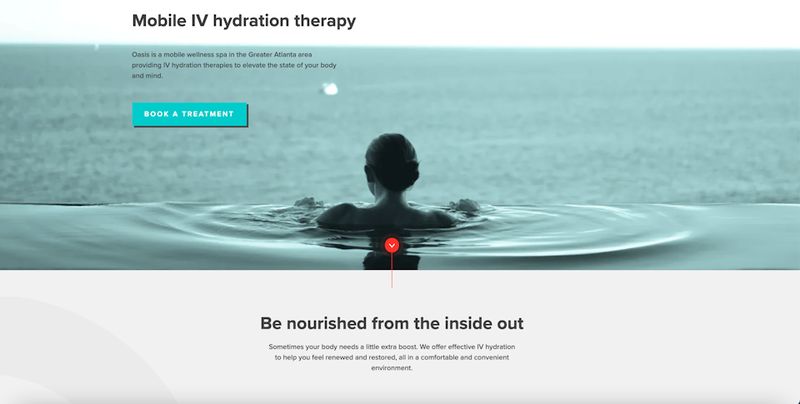
Oasis Hydration's leading content block adds visual movement and stylized copy.
The leading content block we designed for this website works in conjunction with the hero message to add visual movement down the page. The copy—describing Oasis’ IV hydration therapy—is similar to the hero message but provides additional stylized language.
Other times, leading content blocks can follow a hero message to offer a company description or support your brand’s authority.
Windamir Construction, our client who builds military and federal facilities, is engaged in sensitive work, often contracted by branches of the military or the US government.
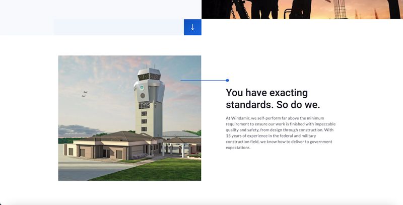
Windamir Construction's leading content block underscores their company reputation.
Potential customers must understand that their services can be trusted and completed to exacting standards, so the leading content block serves as a testament to their 15 year-long experience in the field. This information is as important as the description of their work in the hero, so this messaging immediately follows the top message.
If your website doesn’t serve a sales purpose or your company doesn’t offer products or services—as often is the case with websites for nonprofits, charities or municipalities—the leading content block can serve as a vehicle to discuss your mission or provide needed context for your website.
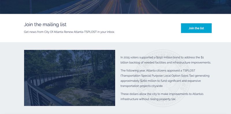
The City of Atlanta's TSPLOST website features important context about the city's projects in the leading content block.
When we worked with the city of Atlanta to design a website to house information about the city’s expansive infrastructure projects, the leading content block served as a means to describe the city’s improvements. Because the website served as a tool for residents to track new projects, providing context for the size and expanse of the city’s efforts was essential for user comprehension.
Products and Services Overview
As users move down your page, the most effective way to draw visitors down your sales funnel is by overviewing products and services. Site visitors want to find targeted information that solve their problems efficiently, and providing consumers with a means to learn about or discover your company’s offerings is an important convention of homepage design.
After visiting a homepage, 86% of users want to learn about your company’s products and services next, so featuring product-specific content and a portal to a product or services page is key to addressing your customers’ questions as quickly as possible.
Overviewing products and services on a homepage is an important way-finding tool, directing site visitors to move through your website and sales funnel.
Like every element we’ve discussed, a products and services overview may take many forms.
Some companies may decide to briefly summarize all of their offerings, often with accompanying graphic elements that help to visualize their services. Businesses usually find that this is the most effective way to succinctly overview what they do and how their offerings solve customers’ problems.
This strategy is particularly helpful when a company offers a wide variety of services that can’t be summarized in a hero message or leading content block.
Our client Helicopter Express, a helicopter chartering company, provides a number of differing services to their customers, from filmmaking to construction work.
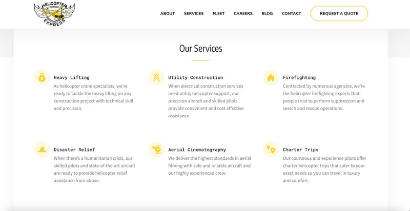
Helicopter Express features a comprehensive summary of their services on the homepage.
We featured an overview of all their potential services on their homepage, allowing a viewer to quickly get a sense of the company’s full capabilities while providing essential information about each activity.
Alternatively, many companies choose to include photos, rather than text descriptions, of their products and services.
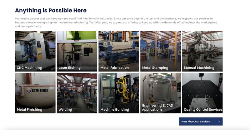
Sohacki Industries features pictures of their machinery on their homepage.
Our client Sohacki Industries is a machine shop that provides manufacturing services for a wide variety of applications. Rather than listing descriptions of the hundreds of manufacturing capabilities their machines can provide, their homepage features pictures of each type of machinery in their shop.
Other times—as we mentioned above with Excelerra software—a company’s products and services must be front and center on the website, and a products and services overview can be combined with a hero message or a leading content block.
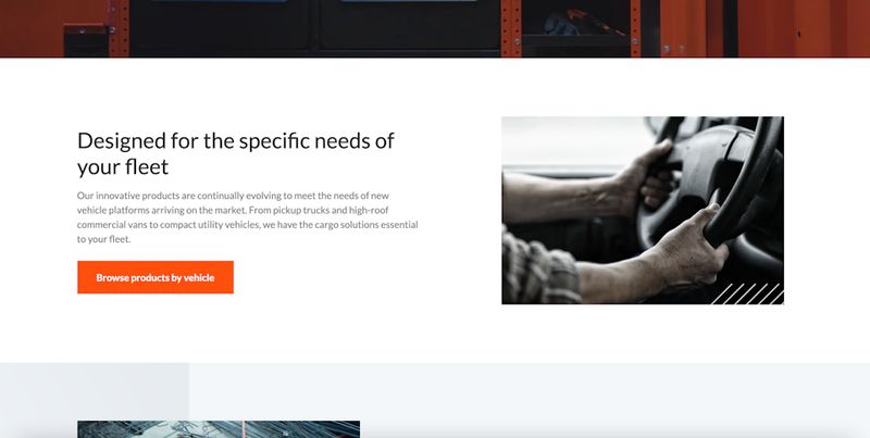
We included information about products and services throughout Masterack's homepage.
With Masterack, a customer of ours and industry leader in commercial grade cargo tools, we addressed their products in the leading content block, providing a button that directed users to browse their product line. Down the page, we included a second, more traditional products and services element, offering more context for their well-reputed products and prompting users to view their catalogue again.
Trust Building Content
When we work with a company to overhaul their site, we almost always suggest including trust building content on the homepage. In general, trust building content can encompass a wide umbrella of content and social proof, like client testimonials, product reviews, partner logos, professional associations and awards.
For many companies with retail products or services, testimonials or reviews are particularly useful on the homepage. Some businesses dealing with sensitive services or complicated products benefit from justifying their reputation in a high stakes field. And in B2B settings, showing recognizable, trusted brands who use your service is a crucial element to establish integrity.
Trust building content adds to your company’s credibility and builds confidence that your business is able to competently and fully solve your customer’s problems.
92% of consumers read online reviews and testimonials when considering a purchase. 88% trust online reviews as much as personal recommendations, and 72% say positive reviews and testimonials make them trust a business more. This means that including social proof or trust building content on your homepage can make or break whether you’re able to convert site visitors into customers.
In fact, when a consumer reads a review on your website, your company generates 62% more revenue from that user.
Some companies choose to include block testimonials on their site, usually in the form of a detailed quote from a customer of authority—a manager or CEO—who attests to the quality of your product or service. This strategy may be most effective for companies who sell a singular product, like software.
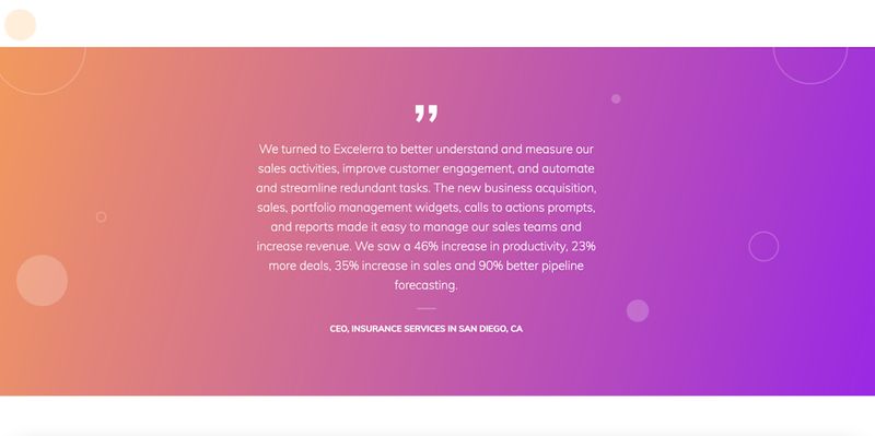
We included a block testimonial on Excelerra Software's homepage.
Because Excelerra’s software is designed to increase sales and performance efficiencies, specific testimony from a CEO whose company adopted the product was crucially helpful in proving its concept. Excelerra’s block testimonial included specifics about their software’s effectiveness, as well as their product’s ability to improve sales performance, productivity and data forecasting.
Other businesses, like Oasis Hydration, may find that a compilation of customer reviews is more effective. This is most often the case when a company provides a lifestyle service or retail product.
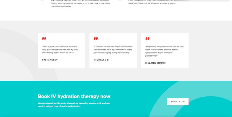
We included customer reviews that mentioned specific team members on Oasis Hydration's homepage.
Because Oasis Hydration offers supplemental therapeutic services, customer reviews are a key consideration for building trust among site visitors interested in Oasis’ alternative IV hydration therapy. We included reviews on their homepage that gave credence to their customer service, and we included reviews that named specific team members.
Including client and partner logos on a homepage is a great way to provide social proof of your services and verify that your company is a trusted service provider for recognizable brands.
Other businesses may opt out of testimonials or customer reviews in favor of including the logos of prominent customers or partners.
Including client and partner logos on a homepage is a great way to provide social proof of your services and verify that your company is a trusted service provider for recognizable brands in your industry—or in consumer culture at large. Often, this method of trust building is important or businesses who may offer technically complicated or sensitive services to their customers.
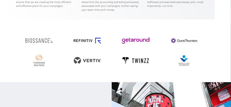
Including client logos on Agency672's homepage supported the caliber of work they complete.
For example, Agency672, a customer of ours who provides out-of-home media services, worked with us to include partner logos on their homepage, since establishing the ability to manage sizable and consequential campaigns was key.
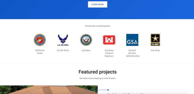
Including military partner logos on Windamir Construction's homepage was essential for building trust with clients.
Sometimes, the inclusion of partner logos may provide the ultimate testament to your effectiveness and ability as a company. Windamir Construction is a building contractor for the military and federal government, so displaying the logos of military branches like the Marine Corps, Air Force, Navy and Army provides penultimate proof of their ability to handle military construction.
Call to Action
We write about calls to action often on our blog, and—along with the hero message—calls to action are among the most important elements of your website’s homepage design. We include a call to action on almost every web page we build.
Calls to action direct your visitors to perform the behaviors necessary to transform into customers or become a part of your organization, and they’re among the most important components of your lead conversion strategy.
Surprisingly, over 70% of small businesses and B2B companies do not have a call to action on their homepage, a major deficit that we correct in all of the pages we design for our clients.
A call to action at the bottom of your homepage synthesizes the collective narrative of your home structure to entice your user to interact directly with you as a company or organization.
If included in the hero message, a call to action typically points your viewer to contact the company, learn more about your products, or purchase your services. Most commonly, a call to action at the bottom of your homepage synthesizes the collective narrative of your home structure to entice your user to interact directly with you as a company or organization.
Most importantly: Calls to action promise future satisfaction, and they engage with your potential customers candidly.
If done right, a call to action is a clear, concise and coherent distillation of your company’s usefulness, brand message and service to your customer. It ties together every piece of your homepage into a powerful, carefully worded and visually compelling message that engages your customers into response.
Beyond pure lead conversion, calls to action can redirect users to more helpful information as they decide whether to contact your company or purchase your products. Where a more protracted sales funnel and decision making process is involved, directing users to additional resources can be helpful.
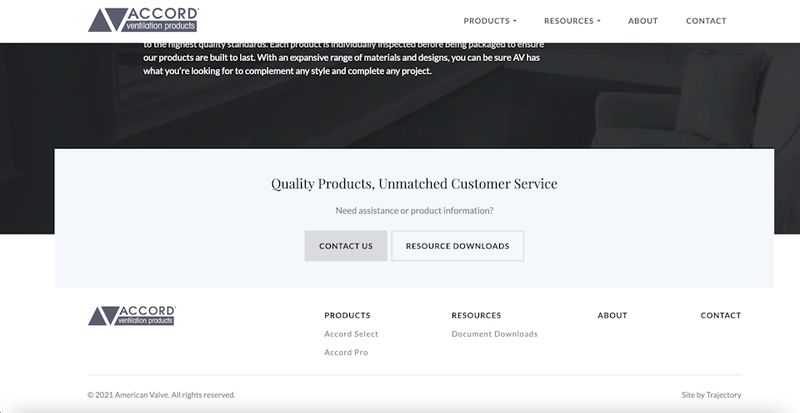
Responding to user intent on Accord's homepage, we included helpful resources in their call to action.
This is the strategy that Accord Ventilation, our client who produces air ventilation products, pursued on its homepage. Because Accord distributes their products through several retail partners, most visitors come to their website looking for specs, installation instruction and product support. So, Accord’s call to action featured a “Contact Us” prompt and a link to download additional resources.
Ultimately—and regardless of a CTA’s technical purpose—a call to action needs to be eye-catching, and it must communicate that your company is of service to your customers’ needs.
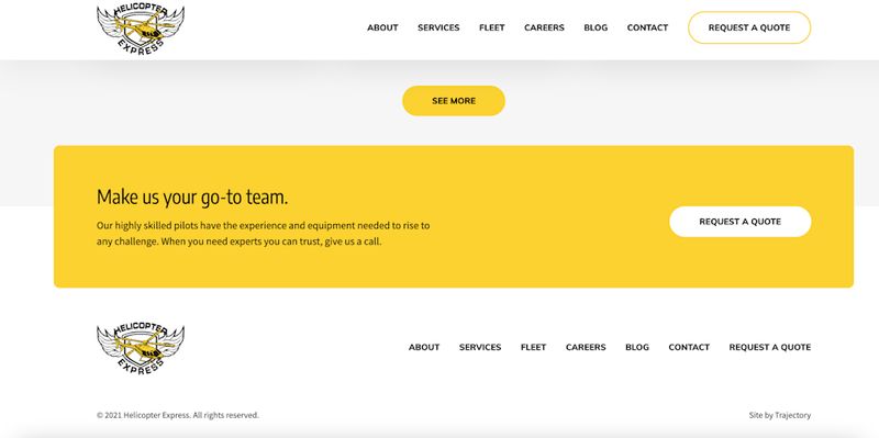
Helicopter Express' call to action immediately catches the user's eye.
Helicopter Express’ call to action is a great example of a succinct, catching final message. Using the company’s bright and distinctive yellow, Helicopter Express’ call to action immediately catches the user’s eye as they reach the bottom of the homepage. A direct rhetorical question—“What can our fleet do for you?”—instantaneously engages the audience into action and response, making clear that the company is of service to each customer.
Other Elements
In general, these—a hero message, leading content block, product overview, trust building content, and call to action—are the most common and used components of a website’s homepage design. They form the foundation of a narrative structure that introduces your message, brand and services.
But they’re far from the only things you might encounter on a homepage.
We work with clients to find the right combination of content, design and information for their needs, often expanding beyond these basic components to craft more serviceable and responsive homepages.
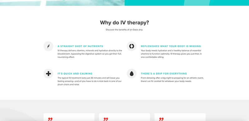
Oasis Hydration included additional content on their homepage that addressed customers' questions about their services.
Sometimes, a company might prefer to include information that addresses users’ questions about their service or industry, as is the case with Oasis Hydration. We included a “Why Do IV Therapy” content block that further described their services and met potential questions about their product.
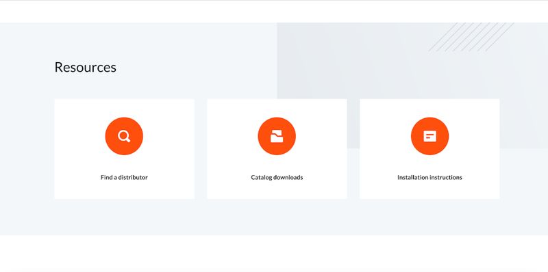
We included additional resources and tools on Masterack's homepage.
Often, clients feature custom-designed resources and tools on their homepage. For example, we worked with our client Masterack to build a “Find a distributor tool” that helped potential customers locate a local business that sold Masterack’s products. A useful and important resource, we made sure to include the tool on the homepage for users who were ready to purchase a product.
Ultimately, the components of your homepage work together to build a cohesive picture of your company while answering visitors’ questions quickly and efficiently. Your homepage should aid in lead generation while lending style and substance to your business.
In conclusion: What are the 4 major objectives of any homepage?
So, what does all of this add up to? We’ve broken down website homepage design into its most distinctive and detailed components. Put together, what should they work to achieve?
In short, the structure, design and content of your homepage should achieve four major objectives for your audience, whether a user lands on your homepage when they discover your website or if they visit the homepage after first landing on an interior page from a search engine.
Your homepage should:
1. Make a good first impression
The homepage is the most visited page on your website, and it’s most responsible for introducing site visitors to your company, message and products.
It takes users approximately 50 milliseconds to form an opinion about your website, and your homepage should prove to them that your company is able to solve their problems, establish trust, and engender a clear brand identity.
The hero message is key for introducing your business, nailing down your brand’s tone, and establishing an initial visual aesthetic for your company. As users work their way down the homepage, elements like trust building content prove that your company is reliable and credible.
2. Pave the way to other pages
While your homepage establishes users’ first impression of your company—synthesizing your entire website into a distilled and whole presentation—it is, after all, an initial impression.
Your homepage should present a clear picture of your entire company and organization, but it should leave plenty of room for users to visit other pages in order to put together a complete picture of your business. This is key for guiding users down your sales funnel or aiding existing customers who’ve come to your site for additional resources.
Beyond your site navigation structure and menu, the content on your homepage should link out to other pages and, through carefully constructed copy, key users into various aspects of your business through careful rhetoric.
Your homepage should present a composite impression of your company, but leave room for users to visit other pages to put together a complete picture of your business.
Homepage elements like product overviews, custom tools, or featured blog posts will guide users through your site, encourage deeper browsing, and discourage a high bounce rate—or the rate at which people leave your site after only viewing one page.
3. Establish credibility
74% of users admit to solely judging a company’s credibility based on their web design, and the homepage carries most of the responsibility to curry a favorable judgement.
A homepage that presents a concise message while addressing your audience’s concerns is among the most effective trust-building tools.
Testimonials and reviews are key for establishing trust and convincing users that your product and services are reputable—and companies can actually increase profits per visitor by including these elements on the homepage.
At the same time, a cohesive and effective homepage does the simple work of creating a pleasing, reliable and cohesive picture of your company.
Ineffective web design—and messaging that is inconsistent or unclear—can quickly cause users and potential customers to cast doubt on your company. A homepage that works together to present an identifiable and concise message while effectively addressing your audience’s concerns is among the most effective tools any business can use to quickly and immediately establish trust.
4. Encourage action
Your entire homepage should be in service of directing users to further explore your site, engage with your products, or become a part of your organization, though this point is especially applicable to your homepage’s call to action.
Encouraging action is literally the first and last function of a website’s homepage, introducing site visitors to a call to action in the hero message and at the page’s conclusion.
90% of people who read your headline also read your call to action copy, and this final theater for capturing users and turning them into customers can determine whether your lead conversion is at all effective.
Crucially, encouraging action ties together every previous component of effective website homepage design: A focused brand message, an aesthetically enticing visual mark, and a strategic, practiced and absolute appeal on behalf of your company.