Your website's hero section is the first thing every visitor sees. It's the highest-stakes piece of copy on your entire site, and it has to do its job in seconds. Most people stare at a blank homepage and freeze, because the pressure of getting this one section right feels enormous.
Here's what the hero section actually needs to do: tell visitors who you are, what you do, and why they should care. That's it. Not a mission statement, not a brand manifesto, not a clever tagline that takes 10 seconds to parse. A clear message that earns the next scroll or click. The good news is that there are proven formulas for this that work whether you're building a B2B site, a SaaS landing page, or an e-commerce homepage.
This guide covers what a website hero message is, four reliable formulas for writing one, how to choose the right imagery and call to action, common mistakes that cost you visitors, and real examples across industries. By the end, you'll have a clear framework for writing (or rewriting) the most important section on your site.
What Is a Website Hero Section?
The hero section is the large, prominent area at the top of your homepage that sits above the fold. It typically combines four elements: a headline, a line or two of supporting text, a visual (image, video, or graphic), and a call to action. Together, these elements form your website's first impression, and for most visitors, they determine whether the rest of your site gets seen at all.
You'll hear this section described by a lot of different names. A hero message or hero statement usually refers to the text content, specifically the headline and supporting copy. Hero text and hero copy mean the same thing. A hero image is the visual element. A hero banner or hero header typically describes the full visual block. These terms all describe parts of the same thing: the section at the top of your homepage that does the heavy lifting.
A hero section needs to communicate three things within about five seconds: who you are (your company or offering), what you do (your product or service), and why the visitor should care (the benefit or outcome that matters to them). If a first-time visitor can't answer those three questions almost immediately, the hero isn't doing its job.
One quick distinction: homepage heroes and landing page heroes follow the same principles, but landing page heroes can be more specific. A homepage hero speaks to your general audience. A landing page hero speaks to a specific segment or campaign. The formulas below work for both.
What a hero section is not: a place to be vague, overly clever, or stuffed with buzzwords. If visitors have to work to understand what you do, most of them won't bother. Clarity always beats creativity here.
For more on homepage strategy:
- B2B Homepage Design: What the Best B2B Homepages Get Right
- A Complete Guide to Website Homepage Design and Content
Why Your Hero Message Matters More Than You Think
Research from Google has shown that people form aesthetic judgments about a webpage in as little as 17 milliseconds, with reliable opinions forming within 50 milliseconds. That's faster than a blink. Your hero section is the primary target of that snap judgment, and with the average attention span shrinking every year, it shapes everything that follows.
Most visitors won't scroll past the hero if it doesn't resonate. Think of it as a filter: it either pulls potential customers deeper into your site or sends them straight to the back button. The hero section directly impacts the overall user experience from the very first moment. When someone lands on your site and can't immediately tell what you do or why it matters, they leave. The average homepage bounce rate sits around 35-45%, and a confusing or generic hero section is one of the biggest contributors.
The hero section is also where your primary CTA lives, which makes it the most important conversion element above the fold. Weak hero copy means weak top-of-funnel performance, even if the rest of your site is strong. Small improvements to hero messaging can move conversion rates in measurable ways, because every visitor passes through this section before doing anything else on your site.
For more on conversion optimization:
Four Proven Hero Message Formulas
Most hero messaging advice boils down to "be clear." That's true, but it's not very helpful when you're staring at an empty text field. These four formulas give you a starting template. Pick the one that fits your business, fill in the blanks, and you'll have a working hero message in minutes, not days.
The Value Proposition Formula
Structure: [What you do] + [for whom] + [key benefit or differentiator]
This is the most universally applicable formula and the safest starting point if you're not sure which approach to take. It works especially well for B2B companies, professional services firms, and anyone whose offering isn't immediately obvious from a logo or product image alone. If you're working with a web design team on a new site, this is usually the formula they'll recommend starting with.
To build yours, start with what you do in plain language (not industry jargon), add who you do it for (be specific if your audience is narrow), and finish with the one thing that makes you different or the primary outcome you deliver. The result should be a headline of roughly 6-10 words, with a supporting sentence or two that adds detail.
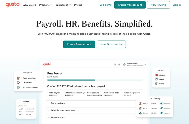
Gusto's homepage is a clean example of this formula in action. The headline "Payroll, HR, Benefits. Simplified." tells you exactly what the product does in four words. The supporting text adds the audience and scale: "Join 400,000+ small and medium-sized businesses that take care of their people with Gusto." Two CTAs ("Create free account" and "How Gusto works") give visitors both a direct action and a lower-commitment alternative. The product screenshot below reinforces the message by showing the actual interface.
The Problem-Solution Formula
Structure: Name the pain point → Present yourself as the solution
This formula works best when your audience has a clear, urgent problem they're trying to solve. The headline calls out the problem (or the frustration behind it), and the supporting text introduces your product or service as the answer. It creates an instant connection because the visitor feels understood before you've asked them to do anything.
SaaS products and consulting services tend to use this formula well because their buyers are usually searching for a specific fix. A headline like "Tired of chasing invoices?" immediately filters for the right audience, and the supporting text can explain how the product eliminates the problem.
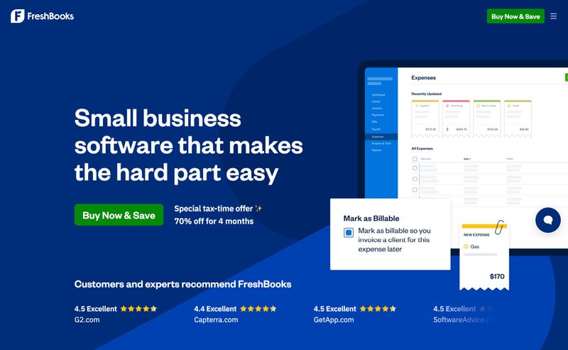
FreshBooks takes a subtle approach to this formula. "Small business software that makes the hard part easy" acknowledges the pain point ("the hard part") without being dramatic about it. The supporting text reinforces with a promotional offer, and the product screenshot shows the interface in action. Review scores from G2, Capterra, GetApp, and SoftwareAdvice along the bottom add social proof. The implicit message: running a small business is hard, and this tool makes it easier.
The risk with this formula is being too dramatic or too vague with the pain point. "Struggling with growth?" is so broad it means nothing. "Spending 10 hours a week on manual reporting?" is specific enough to land.
The Outcome-First Formula
Structure: Lead with the transformation or result the visitor will get
This formula flips the typical approach. Instead of describing what you do, you describe what the visitor gets. The headline paints the end state; the supporting text explains how you help them get there. It works especially well for SaaS products, coaching, education, and any business where the result is more compelling than the process.
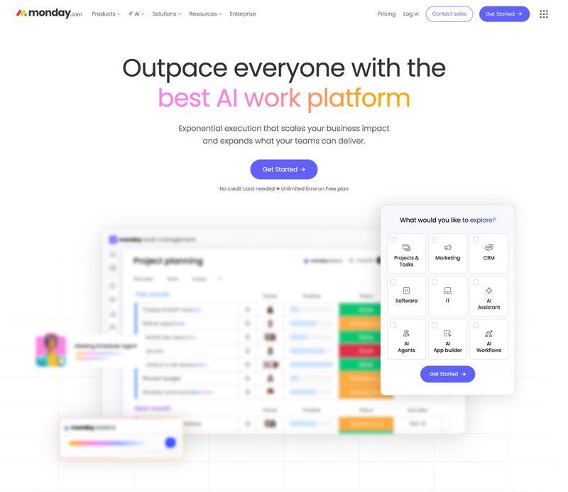
Monday.com's hero leads with a bold outcome: "Outpace everyone with the best AI work platform." The supporting text adds specificity about how ("Exponential execution that scales your business impact and expands what your teams can deliver"). A single "Get Started" CTA keeps it simple, with a reassurance line below ("No credit card needed. Unlimited time on free plan"). The product screenshot shows the platform in context, and an interactive widget lets visitors explore use cases.
The key is being specific about the outcome. "Grow your business" is too vague to mean anything. "Close deals 40% faster" is specific enough to stop someone mid-scroll.
The Direct Statement Formula
Structure: A confident, simple declaration of what you are or do
Sometimes the best hero message is the simplest one. No framing, no formula, no clever hook. Just a clear, confident statement. This works well for companies with a strong brand personality, a very clear niche, or enough name recognition that the hero can focus on a product or campaign rather than explaining the basics.
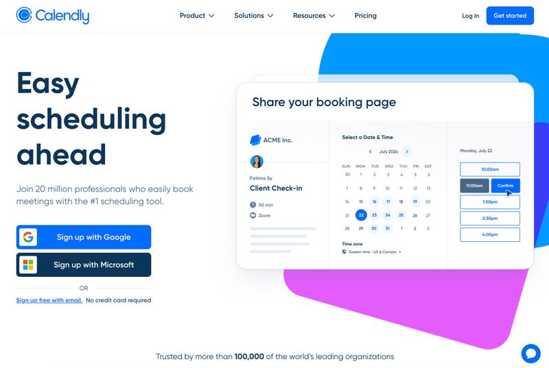
Calendly demonstrates this well. "Easy scheduling ahead" is three words. That's it. The supporting text adds the social proof ("Join 20 million professionals who easily book meetings with the #1 scheduling tool") and the product screenshot shows the booking interface in action. Two sign-up options (Google and Microsoft) make the CTA frictionless. A trust line at the bottom ("Trusted by more than 100,000 of the world's leading organizations") reinforces credibility. The entire hero communicates what Calendly does, why it's trustworthy, and how to get started, all with a headline shorter than most email subject lines.
Adding social proof to a direct statement hero can make it even stronger. A testimonial quote, a client logo bar, or a metric ("Trusted by 10,000 teams") underneath a direct headline gives the confidence of simplicity with the credibility of external validation.
For more on messaging strategy and copywriting:
- B2B Website Messaging Framework: Copy That Resonates
- B2B Website Copywriting: Writing for Committees, Not Individuals
How to Write Your Hero Headline
The headline is the single most important element in your hero section. It's what people read first (and often what they read last before deciding whether to stay or leave). Getting it right matters more than getting the image, animation, or layout right.
Keep your headline between 6 and 10 words. Shorter headlines are more memorable, easier to scan, and more likely to register in the fraction of a second most visitors give your hero. If your headline is running past 12-15 words, you're probably trying to say too much. Move the extra detail to the supporting text underneath.
Clarity beats cleverness, every time. If a stranger who knows nothing about your company or industry can read your headline and immediately understand what you do, it's working. If they'd need context, an explanation, or a second read, rewrite it. Specificity is your friend here. "Next-generation solutions for modern enterprises" means nothing. "Payroll software for small businesses" means everything.
Name your target audience in the headline when it makes sense. "Accounting software for small businesses" is clearer than "Accounting software." "Web design for manufacturers" is more magnetic to a manufacturer than "Web design services." But don't force it if your audience is broad. A company that serves everyone from freelancers to Fortune 500 companies doesn't need to name them all.
If your primary keyword naturally describes what you do, work it into the headline. This helps with SEO, but more importantly, it helps with clarity. Don't distort your message to fit a keyword. If the keyword is "project management software" and that's literally what you sell, it should be in the headline. If the keyword is awkward or unnatural, leave it out and cover it elsewhere on the page.
Your supporting text (the subheadline or the 1-2 sentences below the main headline) is where you add nuance. The headline grabs attention and communicates the core idea. The supporting text explains the value, names the benefit, or adds the specificity that the headline couldn't fit. These two elements work as a pair, not in isolation. Write them together.
Your hero headline should also reflect your brand personality and feel on-brand with the rest of your site. A confident, established brand can be bold and declarative. A brand in a conservative industry (law, finance, construction) may need a more measured, trust-first tone. The hero sets the voice for the entire site experience, so make sure the tone matches who you actually are.
For more on design best practices:
Choosing the Right Hero Image and Visual
The visual in your hero section matters, but not in the way most people think. The image shouldn't be the star. Its job is to support the message, reinforce credibility, and create enough visual interest to hold the visitor's eye while they read the headline and supporting text. If the image competes with the text for attention, or if the text is hard to read over the image, the visual is hurting rather than helping.
There are four broad types of hero visuals that work well, and the right choice depends on what you're selling and what impression you want to make.
- Product or service in context. Show what you sell or do, in use. This works best for products, SaaS tools, and e-commerce. A screenshot of the software in action or a photo of the product being used tells the visitor more in a glance than any headline could. If you have a strong product, let the visual do the heavy lifting.
- People. Real photos of customers, team members, or the person behind the brand build trust and human connection. The key word is "real." Generic stock photography (the smiling team in a conference room, the woman pointing at a whiteboard) will undermine your credibility faster than no image at all. If you can't afford custom photography, consider the other options.
- Abstract or branded graphics. Illustrations, gradient backgrounds, geometric patterns, and custom graphics work well when photography isn't available or when a strong visual brand identity is the priority. These can be eye-catching and distinctive without requiring a photoshoot. SaaS companies often go this route effectively.
- Video and animation. Short, looping background video or subtle animation effects (parallax scrolling, animated text reveals, micro-interactions on hover) can add energy and draw the eye. Video heroes are increasingly common and can communicate more in a few seconds than a static image ever could. But motion must serve the message, not distract from it. Always provide a static fallback for slower connections and accessibility.
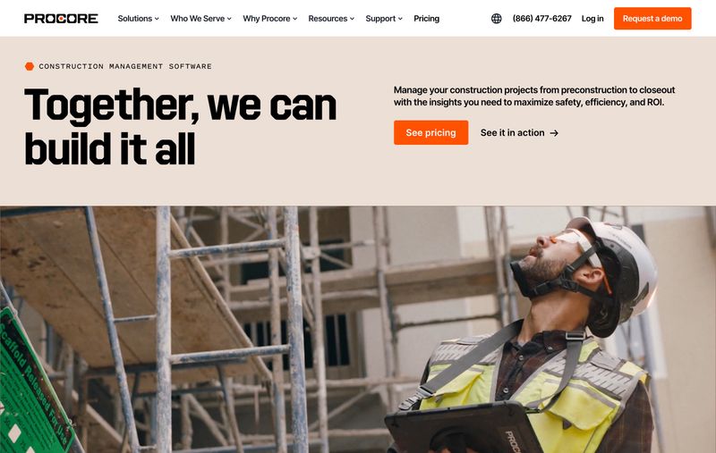
Procore's hero is a strong example of combining real photography with clear messaging. The construction site photo immediately communicates the industry (construction management), while the headline "Together, we can build it all" sits alongside supporting text that explains the product's scope. The two CTAs ("See pricing" and "See it in action") give visitors both a transactional and an exploratory path forward. The image supports the message without competing with it.
Typography is part of the visual equation too. Bold, readable fonts are essential for hero headlines. The trend toward large, expressive type isn't going anywhere, but legibility on all screen sizes comes first. If your hero headline looks great on desktop but becomes unreadable on a phone, it's not working. Design for both viewports from the start.
Performance matters here more than anywhere else on the page. Large, unoptimized hero images are the number-one killer of page load time, and they tank the user experience before it even starts. An image that adds 3 seconds to your load time will hurt both conversions and search rankings. Use modern formats (WebP or AVIF), serve responsive sizes for different devices, and compress aggressively. A fast-loading hero with high-quality compressed images will outperform a gorgeous hero that takes 4 seconds to appear.
For more on page performance:
Writing a Hero Call to Action That Converts
Every hero section needs at least one call to action. The CTA is the entire point of the hero. All the messaging, imagery, and design exist to earn one thing: a click. If your hero section has no CTA, or the CTA is vague and buried, you're wasting the most valuable real estate on your site.
The most effective hero CTAs use a primary and secondary button pattern. The primary CTA is the main action you want visitors to take ("Get a Demo," "Start Free Trial," "Request a Quote"). The secondary CTA is a lower-commitment alternative for visitors who aren't ready for the primary action ("See How It Works," "View Pricing," "Explore Our Work"). Two options respect the fact that visitors arrive at different stages of readiness. Pushing a hard CTA on someone who's just starting their research feels aggressive. Offering a softer alternative keeps them on the site.
CTA button text should be specific. "Get Started" is weaker than "Start Your Free Trial." "Learn More" is weaker than "See Our Work." "Submit" is weaker than almost anything. The text should tell the visitor exactly what happens when they click. Specificity reduces friction because the visitor knows what to expect.
Visual design matters just as much as the words. The CTA button needs high contrast against the hero background, enough whitespace around it to stand out, and enough size to be impossible to miss. If visitors have to search for the CTA, it's not prominent enough. The button should be the most visually distinct element in the hero after the headline.
Match your CTA to your audience's intent. If most of your traffic comes from organic search and these visitors are early in their research, a "Buy Now" CTA will feel pushy. "See How It Works" or "View Case Studies" matches where they are in the decision process. If your traffic is mostly referral or direct (people who already know you), a more direct CTA like "Get a Quote" or "Schedule a Call" is appropriate.
Don't guess what works. A/B test your hero headline and CTA text. Even small wording changes ("Get a Demo" vs. "See It in Action") can shift conversion rates by double-digit percentages. Most website platforms make this straightforward, and the hero section is the highest-impact place to run tests because every visitor sees it.
For more on CTAs and buyer journey alignment:
- Everything You Need to Know About Compelling Calls to Action
- B2B Buyer Journey Mapping: Building Websites That Convert
Hero Section Mistakes That Cost You Visitors
Knowing what to do is half the picture. Knowing what not to do saves you from the mistakes that make visitors leave before they've given your site a real chance.
- Vague or clever-first headlines. "Empowering Tomorrow's Innovators" sounds impressive in a boardroom and means absolutely nothing to a website visitor. If someone has to think about what you do, you've already lost them. Clarity is not boring. Clarity converts.
- Too much text above the fold. The hero is not a paragraph. It's a headline, 1-2 sentences of supporting text, and a CTA. That's it. Every extra sentence pushes your CTA further down and dilutes the message. If you have more to say, say it below the fold.
- Generic stock photography. The conference-room-handshake photo, the woman-pointing-at-laptop photo, the perfectly-diverse-team-smiling photo. Visitors recognize stock images instantly, and they erode trust. If you can't invest in custom photography, abstract graphics or a high-quality product screenshot are better than fake people.
- No CTA, or a buried CTA. Still surprisingly common, especially on older sites or redesigns where aesthetics took priority over functionality. If visitors can't figure out what to do next without scrolling, the hero has failed at its most basic job.
- Ignoring mobile. A hero that looks beautiful on a 27-inch monitor but becomes an unreadable mess on a phone fails for more than half your audience. Test on real devices. Make sure the headline, supporting text, and CTA are all visible and legible without zooming.
- Slow-loading hero images. An uncompressed 5MB hero image can add 3+ seconds to your page load time. Visitors won't wait. Neither will Google. Optimize your hero image before you worry about anything else on the page.
For more on building credibility:
Hero Message Examples by Industry
Theory is useful, but seeing these principles in action makes them stick. Here are hero sections from live websites that demonstrate different formulas and approaches, with a brief analysis of what makes each one work.
B2B / Professional Services
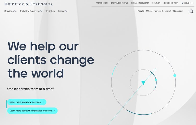
Heidrick & Struggles is a global executive search and leadership consulting firm. Their hero leads with an outcome-focused statement: "We help our clients change the world. One leadership team at a time." The headline is bold and aspirational, but the supporting line grounds it with specificity. Abstract geometric graphics with a subtle gradient reinforce a premium, modern brand identity without competing with the text. Two CTAs ("Learn more about our services" and "Learn more about the industries we serve") offer clear exploratory paths.
Professional services firms often struggle with hero messaging because their work is complex and varies by engagement. The best approach is usually to lead with the outcome or transformation, then let visitors self-select through navigation or CTAs that point toward specific service areas.
SaaS / Technology
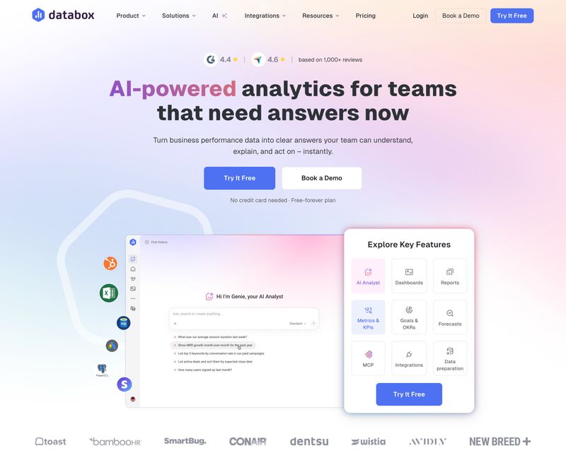
Databox shows how a SaaS hero can combine clarity with social proof. The headline "AI-powered analytics for teams that need answers now" hits the value proposition formula cleanly: what it does (AI-powered analytics), who it's for (teams that need answers), and the differentiator (speed, implied by "now"). Review ratings from G2 and Trustpilot sit at the very top, providing credibility before the visitor even reads the headline. Dual CTAs ("Try It Free" and "Book a Demo") give visitors two commitment levels, and a logo bar at the bottom names recognizable brands.
SaaS heroes tend to be the most consistently well-designed category because these companies live and die by conversion rates. If you're looking for hero section inspiration, SaaS homepages are a good place to study regardless of your industry.
Construction / Industrial
Procore's hero (shown earlier in the hero image section) is worth revisiting as an industry example. Construction and industrial companies face a unique challenge: their products and services are complex, technical, and not easily communicated in a few words. Procore solves this by leading with a collaborative, aspirational message ("Together, we can build it all") while the supporting text provides the specific value (manage projects from preconstruction to closeout). The construction site photography immediately signals the target industry.
Manufacturing and industrial companies often default to vague, corporate-sounding hero text because their offerings are technical. The fix is to focus on the outcome for the buyer rather than the technical specifications of the product. "Manage your construction projects from preconstruction to closeout" is clearer than "Integrated construction management solutions."
For more on B2B homepage design:
Start With Clarity, Then Refine
Don't aim for the perfect hero message on the first try. Write the clearest possible version of who you are, what you do, and why the visitor should care. Put it live. Then test it, watch how visitors respond, and iterate based on what you learn. Your hero section should be a living part of your content strategy, not a set-it-and-forget-it element.
If you're stuck on where to start, use the value proposition formula. It's the most universally applicable, the hardest to get wrong, and it forces you to answer the three questions every hero needs to address. You can always evolve toward a more creative approach once the fundamentals are working.
The hero is just one piece of your homepage strategy. It's the most visible piece, but the rest of the page needs to deliver on whatever promise the hero makes. If the hero earns the scroll, the content below it needs to earn the click.
Recommended next reads: