Want to know a secret?
Most of your website visitors won’t take action unless you ask them to.
That’s where calls to action come into play. Calls to action are commonly used in all forms of marketing, and your website is no exception. Their purpose is to prompt a user to do something, and as such, they play an integral role in your sales pipeline, helping your visitors become leads, leads become customers, and customers become loyal patrons of your brand.
Great websites provide a great user experience with a clear path of action, and often include at least one compelling call to action per page. These help ensure that visitors go where you want them to go, no matter which page of your website they find first. Whether you want users to fill out a form, make a donation, or join your email list, your calls to action are meant to compel them to take that step.
A recent study found that when done right, calls to action on the landing page can increase conversion rates by a whopping 80%. But according to Small Biz Trends, 70% of small business B2B sites lack a clear call-to-action.
The purpose and placement should be clear and relevant
Calls to action need to be strategic and based on your marketing goals. But above all, they need to make sense to the user. Here are some of the most common ones we see:
- Learn more
- Subscribe to our blog
- Subscribe to our newsletter
- Request demo/quote
- Meet the team
- Sign up
- Get started
- Start your free trial
Before you can even consider where to place these calls to action on a page, you need to first consider which one belongs on which page.
For example, a call to action to subscribe to your company’s blog makes perfect sense on your main blog page or within a blog post. But on your Services page, where visitors are more interested in the specific of how to work with your company, you would be better served by a call to action encouraging users to book a demo or request a quote. Here at Trajectory, we work closely with our web design clients to ensure that each page’s call to action fits seamlessly with how visitors use the site.
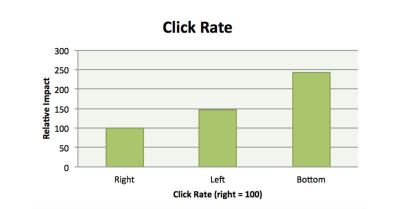
Placement on your web page can affect your results. Calls to action can be forms, buttons, or text and be placed in a sidebar, in the navigation, as a pop-up, at the end of posts, and more. But a study from Neil Patel suggests that calls to action at the bottom of a page (and on the left side) may be more effective than the same prompt placed higher:

Consider what actions you want your users to complete, then develop a strategy for placing them on pages where they are clear and relevant to the user at that point in time. They should make sense on the page they’re on, make sense with the content around them, and provide clear information about what will happen when the user follows them. This will give you a solid foundation for optimizing their design and content.
The design should capture a user’s attention
Purpose and placement will play a huge role in the success of your calls to action, but without a great design, they might never be noticed. The whole point of good web design is to draw users’ eyes to what you want them to see. Here at Trajectory, we put a ton of thought into the fonts we use, the spacing between lines of text, the height and width of each section — all to provide an attractive, cohesive, and simple experience for your users.
One way to do this is to incorporate more visuals into a call to action. Brafton, a content marketing company, found that adding buttons to their calls to action increased revenue by 83% in one month.
Bold colors are another effective way to draw attention and emphasis. Most studies on button colors indicate orange, green, and red as the most effective, but depending on your website’s color scheme, you may need to consider a different color in order to achieve a high enough level of contrast.
And while many blogs will claim that one color is always most effective, or that buttons always work better than forms, the truth is there is no one-size-fits-all solution. The most effectively designed CTAs look completely different based on the context and layout of the entire page.
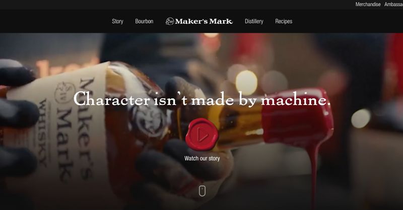
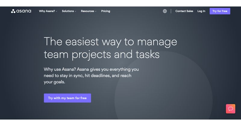
For example, check out the differences between the successful CTAs on each of these four landing pages:

Maker’s Mark keeps their landing page simple and visual.

Asana uses a dark color scheme and a single button.
Work with your web designer to consider each of the design elements that impact the effectiveness of your calls to action. And as with all of your marketing efforts, test out different options to compare what works best for you and your users.
The content should describe and entice
Once you’ve strategically considered the purpose, placement, and design of a call to action, you have one important piece left: copy. It’s fairly straightforward to understand, but it can be difficult to master (check out our previous blog post detailing our approach to writing powerful website copy if you need help).
The content of a call to action functions similarly to that of an advertisement: it’s a short piece of copy that’s meant to grab attention, raise interest, provide information, and compel action. Copy allows you to tell the user exactly what it is they can expect when they follow the call to action. It also allows you to speak directly to the user before they either decide to click through or move on.
Whether you’re writing your own website content or having your web design team handle it for you, ensure that the call to action copy prompts a sense of urgency, describes the offer, and uses words to entice a user.
That last part — enticing users — is especially important, as this is what makes your call to action seem so irresistible that your site visitors just can’t help but click. One way to up the click appeal is to introduce scarcity, like offering a limited-time deal. And studies show that offering a free trial can increase conversions by 328%.
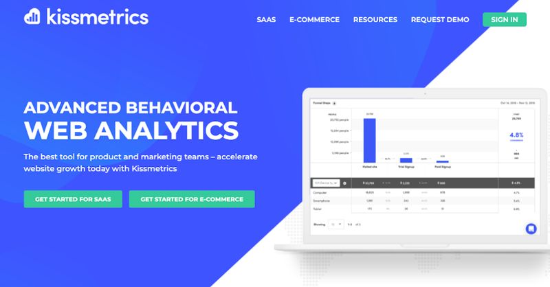
Take a look at these websites whose calls to action do just that:

QuickBooks offers a clear value proposition.

Kissmetrics makes bold claims about its product.
In addition to enticing users, here are a few more ways we take the content of your call to action up a notch:
Use first-person
Changing the button text from second person (“get your free template”) to the first person (“get my free template”) resulted in a 90% increase in clicks for Michael Aagard of Content Verve. Phrasing your call to action this way mirrors your users’ own though patterns, making your copy resonate with them more strongly and encouraging them to act more quickly.
Keep the character count low
A great CTA shouldn’t be a full sentence, but a short phrase that’s no longer than four to seven words if possible. Button text should be short and sweet, too — anything longer than 2-5 words should be shortened. This keeps your visitors interested in your offer so they don’t lose momentum as they move through your sales funnel.
Finally, remember that if a user has filled out a form or followed the prompt in a call to action, this is the point when they are most interested in your brand. Use strategic copy to thank them, reiterate what they can expect (How frequently will you be emailing them from the email list? When will you follow up with their contact form inquiry?), and drive them to other pieces of content they may be interested in.
Want to know how your website can convert visitors more effectively? Get in touch.